【Matplotlib】pythonで密度プロット(Density plot)
pythonの相関を見る際に密度プロットを作成することを今回の目標とします。 Kernel Density Estimation (カーネル密度推定; KDE)とは、ある有限の標本の中から確率変数の確率密度関数を推定手法のうちの一つである。
詳しい説明は以下の通りです。
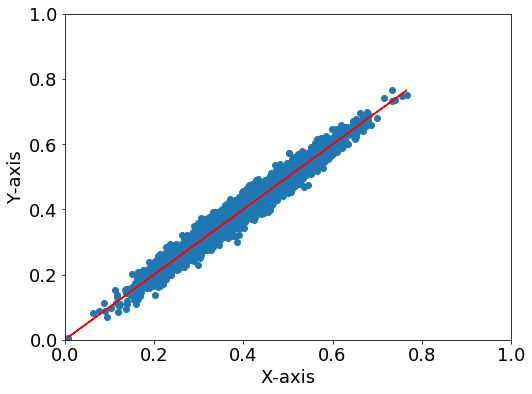
カーネル密度推定 - Wikipedia まずは必要なモジュールをインポートします。 まずはデータを用意します。今回は正規分布のデータを適当に用意しました。 先ほどのデータでは相関関係はわかるのですが、データの分布はわかりません。そこで密度プロットをしてみます。 Points 参考コード 次に縦軸に確率密度を取ったグラフを作成します。
まずは必要なモジュールをインポートします。 データを用意します。正規分布の 新品価格 それでは🌏
はじめに
KDEとは
相関
import numpy as np
import matplotlib.pyplot as plt
from scipy.stats import gaussian_kde
データ
各自データがある方はそれを用いてください。#x, y のデータ用意
mu, sigma = 0, 0.01
x = 10 * np.random.normal(mu, sigma, size=5000) + 0.4
y = x + 2 * np.random.normal(mu, sigma, size=5000)
#回帰直線
p = np.polyfit(x, y, 1)
y_reg = p[0]*x + p[1]
np.random.seed()で乱数を固定します(何回実行しても同じ結果が出るように)。
np.random.normal():正規分布の乱数を作成、 mu : 平均値、sigma: 分散描写
普通の相関プロット
fig = plt.figure(figsize=(8,6))
plt.rcParams["font.size"] = 18

ax=fig.add_subplot(111)
ax.scatter(x, y)
ax.plot(x, y_reg, color="r") #回帰直線

#軸設定
ax.set_xlabel("X-axis")
ax.set_ylabel("Y-axis")
ax.set_ylim(0, 1)
ax.set_xlim(0, 1)
Density plot
fig = plt.figure(figsize=(8,6))
plt.rcParams["font.size"] = 18

ax=fig.add_subplot(111)

#回帰直線
ax.plot(x, y_reg, color="r")

# KDE probability
xy = np.vstack([x,y])
z = gaussian_kde(xy)(xy)
# zの値で並び替え→x,yも並び替える
idx = z.argsort()
x, y, z = x[idx], y[idx], z[idx]
im = ax.scatter(x, y, c=z, s=50, cmap="jet")
fig.colorbar(im)

#軸設定
ax.set_xlabel("X-axis")
ax.set_ylabel("Y-axis")
ax.set_ylim(0, 1)
ax.set_xlim(0, 1)

plt.show()
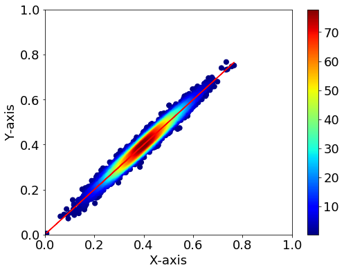
- KDEの計算の後でx,yを並び替えているので、回帰直線のプロットは先にしてください。
- np.vstack([x,y])でxとyを縦方向に結合します。
- .argsort()で並び替え後のインデックスを取得できます。
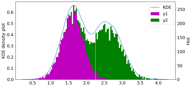
stackoverflow.com確率密度
import numpy as np
import matplotlib.pyplot as plt
#seaborn
import seaborn as sns
from scipy import stats
データ
y1とy2の二山を作成し、yで一つにまとめます。#x
mu, sigma = 0.1, 0.01
x = np.random.normal(mu, sigma, size=5000)
#y
mu, sigma = 0.75, 0.15
y1 = x + 2 * np.random.normal(mu, sigma, size=5000)
mu, sigma = 1., 0.15
y2 = x + 2.5 * np.random.normal(mu, sigma, size=5000)
y = np.append(y1, y2)
描写
fig = plt.figure(figsize=(12,6))
plt.rcParams["font.size"] = 18
ax1 = plt.subplot(111)
ax2 = ax1.twinx()

sns.kdeplot(data=y, label="KDE", ax=ax1)

# ax2.hist(y, bins=100)
ax2.hist([y1, y2], bins=100, stacked=True, color=["m", "g"], label=["y1", "y2"])


#軸設定
ax1.set_ylabel("KDE density plot")
ax2.set_ylabel("Hist")

h1, l1 = ax1.get_legend_handles_labels()
h2, l2 = ax2.get_legend_handles_labels()
ax1.legend(h1+h2, l1+l2, ncol=1)
 軸が二つあるプロットに関しては以下の記事をご覧ください。
参考文献

¥3,630から
(2021/5/5 07:57時点)![]()