【Matplotlib】Python レインボーカラーコード作成(rainbow colorcode)
こんにちは!
今回はカラーバーによく使うレインボーカラーを作成しました!
どこを探しても等間隔の虹色のカラーリストを作ってくれるサイトがなかったので
自分で作りました!
仕上がりはこんな感じです↓

作成
コード
まずは必要なモジュールをインポートします
import matplotlib.pyplot as plt
import numpy as np
それでは作成していきます
c = ["0","1","2","3","4","5","6","7","8","9","a","b","c","d","e","f"]
c_r = ["f","e","d","c","b","a","9","8","7","6","5","4","3","2","1","0"]
c_list=[]
for i in range(16):
    x1 = "#ff"+c[i]
    for j in range(16):
        x2 = x1+c[j]+"00"
        c_list.append(x2)
for i in range(16):
    x1 = "#"+c_r[i]
    for j in range(16):
        x2 = x1+c_r[j]+"ff00"
        c_list.append(x2)
for i in range(16):
    x1 = "#00ff"+c[i]
    for j in range(16):
        x2 = x1+c[j]
        c_list.append(x2)
for i in range(16):
    x1 = "#00"+c_r[i]
    for j in range(16):
        x2 = x1+c_r[j]+"ff"
        c_list.append(x2)
for i in range(16):
    x1 = "#"+c[i]
    for j in range(16):
        x2 = x1+c[j]+"00ff"
        c_list.append(x2)
for i in range(16):
    x1 = "#ff00"+c_r[i]
    for j in range(16):
        x2 = x1+c_r[j]
        c_list.append(x2)
詳しい説明
上記のコードは「赤⇒緑⇒青⇒赤」の順となっています。
まず「c」と「c_r」で必要な16進数の文字を用意します。
次に、空のリスト「c_list」を作成し、そこに「赤⇒緑⇒青⇒赤」の順で入れていきます。
その色の順になるためには、
[#ff○○00]⇒[#××ff00]⇒[#00ff○○]⇒[#00××ff]⇒[#○○00ff]⇒[#ff00××]
の順でfor ループを回していきます。
その時に、
○○は16進法で増える方向に(00⇒01⇒...⇒fe⇒ff)
××は16進法で減る方向に(ff⇒fe⇒...⇒01⇒00)
にします。
次に重複した色を削除します。
#重複文字の削除
col = sorted(set(c_list), key=c_list.index)
これで完成です!
試しに「col」の中身を確認しておきましょう。
図の作成
図1
最後に図を作成しましょう。
fig = plt.figure(figsize=(6,6))
ax=fig.add_subplot(111)

x = np.array([1] * len(col))
ax.pie(x,colors=col)

plt.show()
fig.savefig('XXX.png', format='png', dpi=360)
このカラーは1530色あり、これを等分することによって使いたいときにレインボーのカラーコードが使えます!
図2
たとえば1ヶ月分のカラーコードを作成したいときは、
以下の作業をして1530色をざっくり31個に分けましょう!
#31個に分ける
col_list=[]
for i in range(31):
    a = col[int(len(col)/31) * i]
    col_list.append(a)
図を表示してみます
fig = plt.figure(figsize=(6,6))
plt.rcParams["font.size"] = 10
ax=fig.add_subplot(111)

x = np.array([1] * len(col_list))
ax.pie(x,colors=col_list,labels=col_list)


fig.savefig('XXX.png', format='png', dpi=330)

レインボーカラー
以下を[Ctrl]+[a]で全選択し、[Ctrl]+[c]でコピーして、[Ctrl]+[v]でテキストファイルに保存して使ってください!
#ff0000 #ff0100 #ff0200 #ff0300 #ff0400 #ff0500 #ff0600 #ff0700 #ff0800 #ff0900 #ff0a00 #ff0b00 #ff0c00 #ff0d00 #ff0e00 #ff0f00 #ff1000 #ff1100 #ff1200 #ff1300 #ff1400 #ff1500 #ff1600 #ff1700 #ff1800 #ff1900 #ff1a00 #ff1b00 #ff1c00 #ff1d00 #ff1e00 #ff1f00 #ff2000 #ff2100 #ff2200 #ff2300 #ff2400 #ff2500 #ff2600 #ff2700 #ff2800 #ff2900 #ff2a00 #ff2b00 #ff2c00 #ff2d00 #ff2e00 #ff2f00 #ff3000 #ff3100 #ff3200 #ff3300 #ff3400 #ff3500 #ff3600 #ff3700 #ff3800 #ff3900 #ff3a00 #ff3b00 #ff3c00 #ff3d00 #ff3e00 #ff3f00 #ff4000 #ff4100 #ff4200 #ff4300 #ff4400 #ff4500 #ff4600 #ff4700 #ff4800 #ff4900 #ff4a00 #ff4b00 #ff4c00 #ff4d00 #ff4e00 #ff4f00 #ff5000 #ff5100 #ff5200 #ff5300 #ff5400 #ff5500 #ff5600 #ff5700 #ff5800 #ff5900 #ff5a00 #ff5b00 #ff5c00 #ff5d00 #ff5e00 #ff5f00 #ff6000 #ff6100 #ff6200 #ff6300 #ff6400 #ff6500 #ff6600 #ff6700 #ff6800 #ff6900 #ff6a00 #ff6b00 #ff6c00 #ff6d00 #ff6e00 #ff6f00 #ff7000 #ff7100 #ff7200 #ff7300 #ff7400 #ff7500 #ff7600 #ff7700 #ff7800 #ff7900 #ff7a00 #ff7b00 #ff7c00 #ff7d00 #ff7e00 #ff7f00 #ff8000 #ff8100 #ff8200 #ff8300 #ff8400 #ff8500 #ff8600 #ff8700 #ff8800 #ff8900 #ff8a00 #ff8b00 #ff8c00 #ff8d00 #ff8e00 #ff8f00 #ff9000 #ff9100 #ff9200 #ff9300 #ff9400 #ff9500 #ff9600 #ff9700 #ff9800 #ff9900 #ff9a00 #ff9b00 #ff9c00 #ff9d00 #ff9e00 #ff9f00 #ffa000 #ffa100 #ffa200 #ffa300 #ffa400 #ffa500 #ffa600 #ffa700 #ffa800 #ffa900 #ffaa00 #ffab00 #ffac00 #ffad00 #ffae00 #ffaf00 #ffb000 #ffb100 #ffb200 #ffb300 #ffb400 #ffb500 #ffb600 #ffb700 #ffb800 #ffb900 #ffba00 #ffbb00 #ffbc00 #ffbd00 #ffbe00 #ffbf00 #ffc000 #ffc100 #ffc200 #ffc300 #ffc400 #ffc500 #ffc600 #ffc700 #ffc800 #ffc900 #ffca00 #ffcb00 #ffcc00 #ffcd00 #ffce00 #ffcf00 #ffd000 #ffd100 #ffd200 #ffd300 #ffd400 #ffd500 #ffd600 #ffd700 #ffd800 #ffd900 #ffda00 #ffdb00 #ffdc00 #ffdd00 #ffde00 #ffdf00 #ffe000 #ffe100 #ffe200 #ffe300 #ffe400 #ffe500 #ffe600 #ffe700 #ffe800 #ffe900 #ffea00 #ffeb00 #ffec00 #ffed00 #ffee00 #ffef00 #fff000 #fff100 #fff200 #fff300 #fff400 #fff500 #fff600 #fff700 #fff800 #fff900 #fffa00 #fffb00 #fffc00 #fffd00 #fffe00 #ffff00 #feff00 #fdff00 #fcff00 #fbff00 #faff00 #f9ff00 #f8ff00 #f7ff00 #f6ff00 #f5ff00 #f4ff00 #f3ff00 #f2ff00 #f1ff00 #f0ff00 #efff00 #eeff00 #edff00 #ecff00 #ebff00 #eaff00 #e9ff00 #e8ff00 #e7ff00 #e6ff00 #e5ff00 #e4ff00 #e3ff00 #e2ff00 #e1ff00 #e0ff00 #dfff00 #deff00 #ddff00 #dcff00 #dbff00 #daff00 #d9ff00 #d8ff00 #d7ff00 #d6ff00 #d5ff00 #d4ff00 #d3ff00 #d2ff00 #d1ff00 #d0ff00 #cfff00 #ceff00 #cdff00 #ccff00 #cbff00 #caff00 #c9ff00 #c8ff00 #c7ff00 #c6ff00 #c5ff00 #c4ff00 #c3ff00 #c2ff00 #c1ff00 #c0ff00 #bfff00 #beff00 #bdff00 #bcff00 #bbff00 #baff00 #b9ff00 #b8ff00 #b7ff00 #b6ff00 #b5ff00 #b4ff00 #b3ff00 #b2ff00 #b1ff00 #b0ff00 #afff00 #aeff00 #adff00 #acff00 #abff00 #aaff00 #a9ff00 #a8ff00 #a7ff00 #a6ff00 #a5ff00 #a4ff00 #a3ff00 #a2ff00 #a1ff00 #a0ff00 #9fff00 #9eff00 #9dff00 #9cff00 #9bff00 #9aff00 #99ff00 #98ff00 #97ff00 #96ff00 #95ff00 #94ff00 #93ff00 #92ff00 #91ff00 #90ff00 #8fff00 #8eff00 #8dff00 #8cff00 #8bff00 #8aff00 #89ff00 #88ff00 #87ff00 #86ff00 #85ff00 #84ff00 #83ff00 #82ff00 #81ff00 #80ff00 #7fff00 #7eff00 #7dff00 #7cff00 #7bff00 #7aff00 #79ff00 #78ff00 #77ff00 #76ff00 #75ff00 #74ff00 #73ff00 #72ff00 #71ff00 #70ff00 #6fff00 #6eff00 #6dff00 #6cff00 #6bff00 #6aff00 #69ff00 #68ff00 #67ff00 #66ff00 #65ff00 #64ff00 #63ff00 #62ff00 #61ff00 #60ff00 #5fff00 #5eff00 #5dff00 #5cff00 #5bff00 #5aff00 #59ff00 #58ff00 #57ff00 #56ff00 #55ff00 #54ff00 #53ff00 #52ff00 #51ff00 #50ff00 #4fff00 #4eff00 #4dff00 #4cff00 #4bff00 #4aff00 #49ff00 #48ff00 #47ff00 #46ff00 #45ff00 #44ff00 #43ff00 #42ff00 #41ff00 #40ff00 #3fff00 #3eff00 #3dff00 #3cff00 #3bff00 #3aff00 #39ff00 #38ff00 #37ff00 #36ff00 #35ff00 #34ff00 #33ff00 #32ff00 #31ff00 #30ff00 #2fff00 #2eff00 #2dff00 #2cff00 #2bff00 #2aff00 #29ff00 #28ff00 #27ff00 #26ff00 #25ff00 #24ff00 #23ff00 #22ff00 #21ff00 #20ff00 #1fff00 #1eff00 #1dff00 #1cff00 #1bff00 #1aff00 #19ff00 #18ff00 #17ff00 #16ff00 #15ff00 #14ff00 #13ff00 #12ff00 #11ff00 #10ff00 #0fff00 #0eff00 #0dff00 #0cff00 #0bff00 #0aff00 #09ff00 #08ff00 #07ff00 #06ff00 #05ff00 #04ff00 #03ff00 #02ff00 #01ff00 #00ff00 #00ff01 #00ff02 #00ff03 #00ff04 #00ff05 #00ff06 #00ff07 #00ff08 #00ff09 #00ff0a #00ff0b #00ff0c #00ff0d #00ff0e #00ff0f #00ff10 #00ff11 #00ff12 #00ff13 #00ff14 #00ff15 #00ff16 #00ff17 #00ff18 #00ff19 #00ff1a #00ff1b #00ff1c #00ff1d #00ff1e #00ff1f #00ff20 #00ff21 #00ff22 #00ff23 #00ff24 #00ff25 #00ff26 #00ff27 #00ff28 #00ff29 #00ff2a #00ff2b #00ff2c #00ff2d #00ff2e #00ff2f #00ff30 #00ff31 #00ff32 #00ff33 #00ff34 #00ff35 #00ff36 #00ff37 #00ff38 #00ff39 #00ff3a #00ff3b #00ff3c #00ff3d #00ff3e #00ff3f #00ff40 #00ff41 #00ff42 #00ff43 #00ff44 #00ff45 #00ff46 #00ff47 #00ff48 #00ff49 #00ff4a #00ff4b #00ff4c #00ff4d #00ff4e #00ff4f #00ff50 #00ff51 #00ff52 #00ff53 #00ff54 #00ff55 #00ff56 #00ff57 #00ff58 #00ff59 #00ff5a #00ff5b #00ff5c #00ff5d #00ff5e #00ff5f #00ff60 #00ff61 #00ff62 #00ff63 #00ff64 #00ff65 #00ff66 #00ff67 #00ff68 #00ff69 #00ff6a #00ff6b #00ff6c #00ff6d #00ff6e #00ff6f #00ff70 #00ff71 #00ff72 #00ff73 #00ff74 #00ff75 #00ff76 #00ff77 #00ff78 #00ff79 #00ff7a #00ff7b #00ff7c #00ff7d #00ff7e #00ff7f #00ff80 #00ff81 #00ff82 #00ff83 #00ff84 #00ff85 #00ff86 #00ff87 #00ff88 #00ff89 #00ff8a #00ff8b #00ff8c #00ff8d #00ff8e #00ff8f #00ff90 #00ff91 #00ff92 #00ff93 #00ff94 #00ff95 #00ff96 #00ff97 #00ff98 #00ff99 #00ff9a #00ff9b #00ff9c #00ff9d #00ff9e #00ff9f #00ffa0 #00ffa1 #00ffa2 #00ffa3 #00ffa4 #00ffa5 #00ffa6 #00ffa7 #00ffa8 #00ffa9 #00ffaa #00ffab #00ffac #00ffad #00ffae #00ffaf #00ffb0 #00ffb1 #00ffb2 #00ffb3 #00ffb4 #00ffb5 #00ffb6 #00ffb7 #00ffb8 #00ffb9 #00ffba #00ffbb #00ffbc #00ffbd #00ffbe #00ffbf #00ffc0 #00ffc1 #00ffc2 #00ffc3 #00ffc4 #00ffc5 #00ffc6 #00ffc7 #00ffc8 #00ffc9 #00ffca #00ffcb #00ffcc #00ffcd #00ffce #00ffcf #00ffd0 #00ffd1 #00ffd2 #00ffd3 #00ffd4 #00ffd5 #00ffd6 #00ffd7 #00ffd8 #00ffd9 #00ffda #00ffdb #00ffdc #00ffdd #00ffde #00ffdf #00ffe0 #00ffe1 #00ffe2 #00ffe3 #00ffe4 #00ffe5 #00ffe6 #00ffe7 #00ffe8 #00ffe9 #00ffea #00ffeb #00ffec #00ffed #00ffee #00ffef #00fff0 #00fff1 #00fff2 #00fff3 #00fff4 #00fff5 #00fff6 #00fff7 #00fff8 #00fff9 #00fffa #00fffb #00fffc #00fffd #00fffe #00ffff #00feff #00fdff #00fcff #00fbff #00faff #00f9ff #00f8ff #00f7ff #00f6ff #00f5ff #00f4ff #00f3ff #00f2ff #00f1ff #00f0ff #00efff #00eeff #00edff #00ecff #00ebff #00eaff #00e9ff #00e8ff #00e7ff #00e6ff #00e5ff #00e4ff #00e3ff #00e2ff #00e1ff #00e0ff #00dfff #00deff #00ddff #00dcff #00dbff #00daff #00d9ff #00d8ff #00d7ff #00d6ff #00d5ff #00d4ff #00d3ff #00d2ff #00d1ff #00d0ff #00cfff #00ceff #00cdff #00ccff #00cbff #00caff #00c9ff #00c8ff #00c7ff #00c6ff #00c5ff #00c4ff #00c3ff #00c2ff #00c1ff #00c0ff #00bfff #00beff #00bdff #00bcff #00bbff #00baff #00b9ff #00b8ff #00b7ff #00b6ff #00b5ff #00b4ff #00b3ff #00b2ff #00b1ff #00b0ff #00afff #00aeff #00adff #00acff #00abff #00aaff #00a9ff #00a8ff #00a7ff #00a6ff #00a5ff #00a4ff #00a3ff #00a2ff #00a1ff #00a0ff #009fff #009eff #009dff #009cff #009bff #009aff #0099ff #0098ff #0097ff #0096ff #0095ff #0094ff #0093ff #0092ff #0091ff #0090ff #008fff #008eff #008dff #008cff #008bff #008aff #0089ff #0088ff #0087ff #0086ff #0085ff #0084ff #0083ff #0082ff #0081ff #0080ff #007fff #007eff #007dff #007cff #007bff #007aff #0079ff #0078ff #0077ff #0076ff #0075ff #0074ff #0073ff #0072ff #0071ff #0070ff #006fff #006eff #006dff #006cff #006bff #006aff #0069ff #0068ff #0067ff #0066ff #0065ff #0064ff #0063ff #0062ff #0061ff #0060ff #005fff #005eff #005dff #005cff #005bff #005aff #0059ff #0058ff #0057ff #0056ff #0055ff #0054ff #0053ff #0052ff #0051ff #0050ff #004fff #004eff #004dff #004cff #004bff #004aff #0049ff #0048ff #0047ff #0046ff #0045ff #0044ff #0043ff #0042ff #0041ff #0040ff #003fff #003eff #003dff #003cff #003bff #003aff #0039ff #0038ff #0037ff #0036ff #0035ff #0034ff #0033ff #0032ff #0031ff #0030ff #002fff #002eff #002dff #002cff #002bff #002aff #0029ff #0028ff #0027ff #0026ff #0025ff #0024ff #0023ff #0022ff #0021ff #0020ff #001fff #001eff #001dff #001cff #001bff #001aff #0019ff #0018ff #0017ff #0016ff #0015ff #0014ff #0013ff #0012ff #0011ff #0010ff #000fff #000eff #000dff #000cff #000bff #000aff #0009ff #0008ff #0007ff #0006ff #0005ff #0004ff #0003ff #0002ff #0001ff #0000ff #0100ff #0200ff #0300ff #0400ff #0500ff #0600ff #0700ff #0800ff #0900ff #0a00ff #0b00ff #0c00ff #0d00ff #0e00ff #0f00ff #1000ff #1100ff #1200ff #1300ff #1400ff #1500ff #1600ff #1700ff #1800ff #1900ff #1a00ff #1b00ff #1c00ff #1d00ff #1e00ff #1f00ff #2000ff #2100ff #2200ff #2300ff #2400ff #2500ff #2600ff #2700ff #2800ff #2900ff #2a00ff #2b00ff #2c00ff #2d00ff #2e00ff #2f00ff #3000ff #3100ff #3200ff #3300ff #3400ff #3500ff #3600ff #3700ff #3800ff #3900ff #3a00ff #3b00ff #3c00ff #3d00ff #3e00ff #3f00ff #4000ff #4100ff #4200ff #4300ff #4400ff #4500ff #4600ff #4700ff #4800ff #4900ff #4a00ff #4b00ff #4c00ff #4d00ff #4e00ff #4f00ff #5000ff #5100ff #5200ff #5300ff #5400ff #5500ff #5600ff #5700ff #5800ff #5900ff #5a00ff #5b00ff #5c00ff #5d00ff #5e00ff #5f00ff #6000ff #6100ff #6200ff #6300ff #6400ff #6500ff #6600ff #6700ff #6800ff #6900ff #6a00ff #6b00ff #6c00ff #6d00ff #6e00ff #6f00ff #7000ff #7100ff #7200ff #7300ff #7400ff #7500ff #7600ff #7700ff #7800ff #7900ff #7a00ff #7b00ff #7c00ff #7d00ff #7e00ff #7f00ff #8000ff #8100ff #8200ff #8300ff #8400ff #8500ff #8600ff #8700ff #8800ff #8900ff #8a00ff #8b00ff #8c00ff #8d00ff #8e00ff #8f00ff #9000ff #9100ff #9200ff #9300ff #9400ff #9500ff #9600ff #9700ff #9800ff #9900ff #9a00ff #9b00ff #9c00ff #9d00ff #9e00ff #9f00ff #a000ff #a100ff #a200ff #a300ff #a400ff #a500ff #a600ff #a700ff #a800ff #a900ff #aa00ff #ab00ff #ac00ff #ad00ff #ae00ff #af00ff #b000ff #b100ff #b200ff #b300ff #b400ff #b500ff #b600ff #b700ff #b800ff #b900ff #ba00ff #bb00ff #bc00ff #bd00ff #be00ff #bf00ff #c000ff #c100ff #c200ff #c300ff #c400ff #c500ff #c600ff #c700ff #c800ff #c900ff #ca00ff #cb00ff #cc00ff #cd00ff #ce00ff #cf00ff #d000ff #d100ff #d200ff #d300ff #d400ff #d500ff #d600ff #d700ff #d800ff #d900ff #da00ff #db00ff #dc00ff #dd00ff #de00ff #df00ff #e000ff #e100ff #e200ff #e300ff #e400ff #e500ff #e600ff #e700ff #e800ff #e900ff #ea00ff #eb00ff #ec00ff #ed00ff #ee00ff #ef00ff #f000ff #f100ff #f200ff #f300ff #f400ff #f500ff #f600ff #f700ff #f800ff #f900ff #fa00ff #fb00ff #fc00ff #fd00ff #fe00ff #ff00ff #ff00fe #ff00fd #ff00fc #ff00fb #ff00fa #ff00f9 #ff00f8 #ff00f7 #ff00f6 #ff00f5 #ff00f4 #ff00f3 #ff00f2 #ff00f1 #ff00f0 #ff00ef #ff00ee #ff00ed #ff00ec #ff00eb #ff00ea #ff00e9 #ff00e8 #ff00e7 #ff00e6 #ff00e5 #ff00e4 #ff00e3 #ff00e2 #ff00e1 #ff00e0 #ff00df #ff00de #ff00dd #ff00dc #ff00db #ff00da #ff00d9 #ff00d8 #ff00d7 #ff00d6 #ff00d5 #ff00d4 #ff00d3 #ff00d2 #ff00d1 #ff00d0 #ff00cf #ff00ce #ff00cd #ff00cc #ff00cb #ff00ca #ff00c9 #ff00c8 #ff00c7 #ff00c6 #ff00c5 #ff00c4 #ff00c3 #ff00c2 #ff00c1 #ff00c0 #ff00bf #ff00be #ff00bd #ff00bc #ff00bb #ff00ba #ff00b9 #ff00b8 #ff00b7 #ff00b6 #ff00b5 #ff00b4 #ff00b3 #ff00b2 #ff00b1 #ff00b0 #ff00af #ff00ae #ff00ad #ff00ac #ff00ab #ff00aa #ff00a9 #ff00a8 #ff00a7 #ff00a6 #ff00a5 #ff00a4 #ff00a3 #ff00a2 #ff00a1 #ff00a0 #ff009f #ff009e #ff009d #ff009c #ff009b #ff009a #ff0099 #ff0098 #ff0097 #ff0096 #ff0095 #ff0094 #ff0093 #ff0092 #ff0091 #ff0090 #ff008f #ff008e #ff008d #ff008c #ff008b #ff008a #ff0089 #ff0088 #ff0087 #ff0086 #ff0085 #ff0084 #ff0083 #ff0082 #ff0081 #ff0080 #ff007f #ff007e #ff007d #ff007c #ff007b #ff007a #ff0079 #ff0078 #ff0077 #ff0076 #ff0075 #ff0074 #ff0073 #ff0072 #ff0071 #ff0070 #ff006f #ff006e #ff006d #ff006c #ff006b #ff006a #ff0069 #ff0068 #ff0067 #ff0066 #ff0065 #ff0064 #ff0063 #ff0062 #ff0061 #ff0060 #ff005f #ff005e #ff005d #ff005c #ff005b #ff005a #ff0059 #ff0058 #ff0057 #ff0056 #ff0055 #ff0054 #ff0053 #ff0052 #ff0051 #ff0050 #ff004f #ff004e #ff004d #ff004c #ff004b #ff004a #ff0049 #ff0048 #ff0047 #ff0046 #ff0045 #ff0044 #ff0043 #ff0042 #ff0041 #ff0040 #ff003f #ff003e #ff003d #ff003c #ff003b #ff003a #ff0039 #ff0038 #ff0037 #ff0036 #ff0035 #ff0034 #ff0033 #ff0032 #ff0031 #ff0030 #ff002f #ff002e #ff002d #ff002c #ff002b #ff002a #ff0029 #ff0028 #ff0027 #ff0026 #ff0025 #ff0024 #ff0023 #ff0022 #ff0021 #ff0020 #ff001f #ff001e #ff001d #ff001c #ff001b #ff001a #ff0019 #ff0018 #ff0017 #ff0016 #ff0015 #ff0014 #ff0013 #ff0012 #ff0011 #ff0010 #ff000f #ff000e #ff000d #ff000c #ff000b #ff000a #ff0009 #ff0008 #ff0007 #ff0006 #ff0005 #ff0004 #ff0003 #ff0002 #ff0001
ちなみにテキストファイルの読み込み・書き込み方法↓
読み込み
with open("ファイル名.txt", "r") as f:
    col = f.read().splitlines()
書き込み
1行ずつ開けて書き込みましょう
c = col
with open("ファイル名.txt", "w") as f:
    for d in c:
        f.write("%s\n" % d)
今回はここまでです!
それでは🌏
【Numpy&Matplotlib】相関プロットでエラーバーと回帰直線を表示しよう
こんにちは!
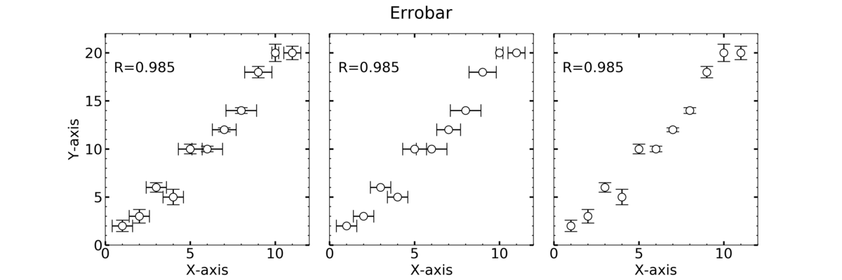
エラーバーはデータの不確実性を示すため、データを示し際には重要です。
今回は、エラーバーを表示する方法をpythonを用いて実装したいと思います。
相関プロット
相関プロットは、高校数学のデータの分析においてよく見たグラフだと思います。
相関係数によって、比較対象の2つの要素の関係がわかります。
データの準備
まずは、以下の2つをインポートします。
'''
import numpy as np
import matplotlib.pyplot as plt
'''
numpy: 計算ツール
matplotlib: 描写ツール
xとyのデータと、それぞれの標準偏差の
データを用意します。
'''
x = np.arange(1,12,1) #1
y = np.array([2,3,6,5,10,10,12,14,18,20,20]) #2
x_err = np.array([0.6, 0.6, 0.6, 0.6, 0.7, 0.9, 0.7, 0.9, 0.8, 0.2, 0.5])
y_err = np.array([0.6, 0.7, 0.5, 0.8, 0.5, 0.3, 0.2, 0.3, 0.6, 0.9, 0.7])
'''
1) np.arange(開始の数, 終りの数, 間隔)
2) np.array([list]) リストをArrayにする。
エラーバー
今回、エラーバーはデータの標準偏差(Standard Deviation)を使います。
#相関係数計算
corr = np.corrcoef(x,y)
相関係数の計算は、np.corrcoef(xのデータ,yのデータ)
でできます。xとyの要素数は揃えないと計算ができません。
corrは配列で出力されます。
⇒array([[1. , 0.9852236],
[0.9852236, 1. ]])
したがって、相関係数は、
corr[0, 1]
corr[1, 0]
のどちらかとします。
グラフ作成
グラフを書いてみます。
fig = plt.figure(figsize=(15,5))
plt.rcParams["font.size"] = 18
plt.suptitle("Errobar")

ax1 = plt.subplot(131)
ax2 = plt.subplot(132)
ax3 = plt.subplot(133)

ax1.errorbar(x, y, xerr=x_err, yerr=y_err, fmt = "o"
             ,markersize = 10,color="k", markerfacecolor="w",capsize=8)
ax2.errorbar(x, y, xerr=x_err, fmt = "o"
             ,markersize = 10,color="k", markerfacecolor="w",capsize=8)
ax3.errorbar(x, y, yerr=y_err, fmt = "o"
             ,markersize = 10,color="k", markerfacecolor="w",capsize=8)

axes = [ax1, ax2, ax3]
for ax in axes:
    #範囲の設定
    ax.set_xlim(0, 12)
    ax.set_ylim(0, 22)

    #メモリの設定
    ax.minorticks_on() #補助メモリの描写
    ax.tick_params(axis="both", which="major",direction="in",length=5,width=2,top="on",right="on")
    ax.tick_params(axis="both", which="minor",direction="in",length=2,width=1,top="on",right="on")

    #ラベルの設定
    ax.set_xlabel("X-axis")
    ax.set_ylabel("Y-axis")

    #テキストの貼り付け
    ax.text(0.5, 18, "R={:.3f}".format(corr[0,1]))

    ax.label_outer()

plt.subplots_adjust(wspace=0.1)
plt.show()

#保存
fig.savefig("XXX.png",format="png", dpi=330)
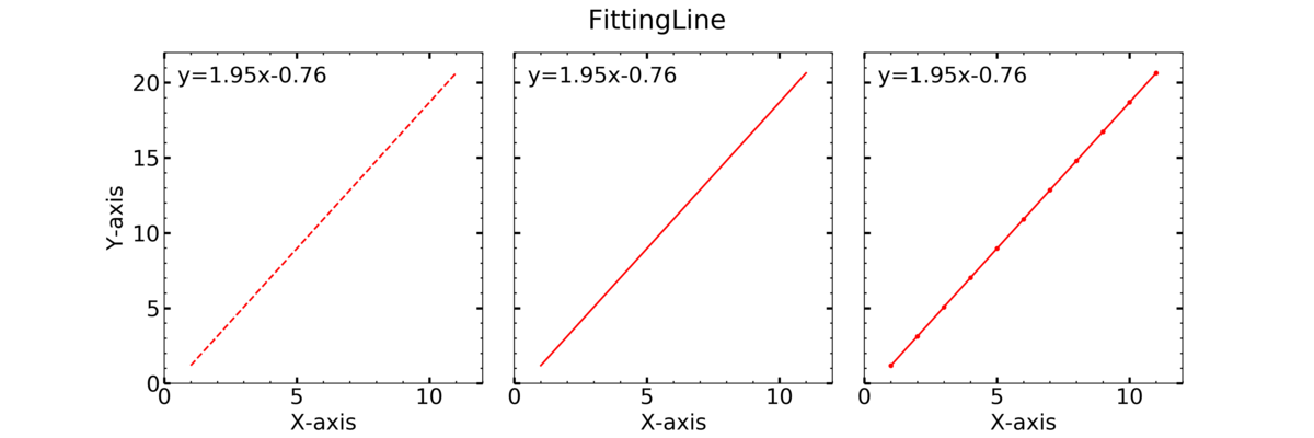
回帰直線
1次の回帰なので、y=ax+bが求める回帰直線です。 以下の操作で計算できます。
#回帰直線
p = np.polyfit(x, y, 1)
y_reg = x*p[0]+p[1]
np.polyfit(xのデータ, yのデータ, 次元)
p[0]=傾き
p[1]=切片
グラフ作成
グラフを書いてみます。
fig = plt.figure(figsize=(15,5))
plt.rcParams["font.size"] = 18
plt.suptitle("FittingLine")

ax1 = plt.subplot(131)
ax2 = plt.subplot(132)
ax3 = plt.subplot(133)

ax1.plot(x, y_reg, "--" ,color="r")
ax2.plot(x, y_reg, "-" ,color="r")
ax3.plot(x, y_reg, ".-" ,color="r")

axes = [ax1, ax2, ax3]
for ax in axes:
    #範囲の設定
    ax.set_xlim(0, 12)
    ax.set_ylim(0, 22)

    #メモリの設定
    ax.minorticks_on() #補助メモリの描写
    ax.tick_params(axis="both", which="major",direction="in",length=5,width=2,top="on",right="on")
    ax.tick_params(axis="both", which="minor",direction="in",length=2,width=1,top="on",right="on")

    #ラベルの設定
    ax.set_xlabel("X-axis")
    ax.set_ylabel("Y-axis")

    #テキストの貼り付け
    ax.text(0.5, 20, "y={:.2f}".format(p[0])+"x{0:+.2f}".format(p[1]))

    ax.label_outer()

plt.subplots_adjust(wspace=0.1)
plt.show()

#保存
fig.savefig("XXX.png",format="png", dpi=330)
相関グラフまとめ
def main():
    fig = plt.figure(figsize=(10,10))
    plt.rcParams["font.size"] = 18

    ax = plt.subplot(111)

    ax.errorbar(x, y, xerr=x_err, yerr=y_err, fmt = "o"
                 ,markersize = 10,color="k", markerfacecolor="w",capsize=8)
    ax.plot(x, y_reg, color="r")

    #範囲の設定
    ax.set_xlim(0, 12)
    ax.set_ylim(0, 22)

    #メモリの設定
    ax.minorticks_on() #補助メモリの描写
    ax.tick_params(axis="both", which="major",direction="in",length=5,width=2,top="on",right="on")
    ax.tick_params(axis="both", which="minor",direction="in",length=2,width=1,top="on",right="on")

    #ラベルの設定
    ax.set_title("Correlation")
    ax.set_xlabel("X-axis")
    ax.set_ylabel("Y-axis")

    #テキストの貼り付け
    ax.text(0.5, 20, "y={:.2f}".format(p[0])+"x{0:+.2f}".format(p[1]))
    ax.text(0.5, 18, "R={:.3f}".format(corr[0,1]))

    plt.show()

    #保存
    fig.savefig("XXX.png",format="png", dpi=330)

if __name__ == "__main__":
    main()

参考
それでは 🌏
【Matplotlib】Python Matplotlib時系列プロット(気温ー日平均)
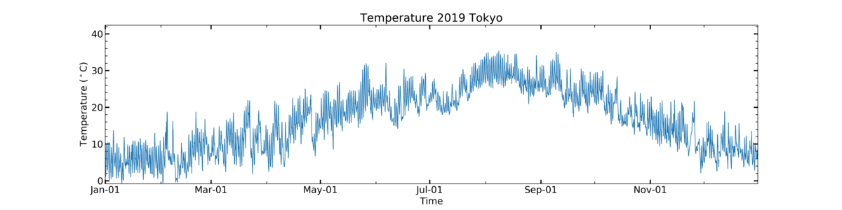
こんにちは! 今日は時系列プロットを紹介します。
時系列プロット
データの取得
縦軸は気温データで、横軸は時間です。
データは気象庁の気温データ(時間平均値)を使用しました。
気象庁|過去の気象データ・ダウンロード
データフレーム(df)の扱い
私のanacondaは日本語を表示する設定をしていないので、
まずはダウンロードしたデータの日本語を英語に変換しました。
(時間→Time, 気温→Temperature ,.... )
それでは必要なモジュールをいれて、データをdfに入れていきます。
import numpy as np
df = pd.read_csv("data/tokyo_temp_2019.csv", header=4)
df.head()
| Time | Temperature | Info | num | |
|---|---|---|---|---|
| 0 | 2019/1/1 1:00 | 1.4 | 8 | 1 |
| 1 | 2019/1/1 2:00 | 2.1 | 8 | 1 |
| 2 | 2019/1/1 3:00 | 1.5 | 8 | 1 |
| 3 | 2019/1/1 4:00 | 1.4 | 8 | 1 |
| 4 | 2019/1/1 5:00 | 1.1 | 8 | 1 |
ファイルタイプがcsvだったのでread_csvを使います。
(csv=Comma Separated Value カンマ区切りの値)という意味
headerは読み飛ばす行を設定します。
それぞれのデータを見てみます。
print(len(df))
print(df.dtypes)
⇒
8760
Time object
Temperature float64
Info int64
num int64
dtype: object
気温がobjectだったので、タイプを日付に変換し、dfの右に貼り付けます。
名前はTime(dt)とします
df["Time(dt)"] = pd.to_datetime(df["Time"])
df
| Time | Temperature | Info | num | Time(dt) | |
|---|---|---|---|---|---|
| 0 | 2019/1/1 1:00 | 1.4 | 8 | 1 | 2019-01-01 01:00:00 |
| 1 | 2019/1/1 2:00 | 2.1 | 8 | 1 | 2019-01-01 02:00:00 |
| 2 | 2019/1/1 3:00 | 1.5 | 8 | 1 | 2019-01-01 03:00:00 |
| 3 | 2019/1/1 4:00 | 1.4 | 8 | 1 | 2019-01-01 04:00:00 |
| 4 | 2019/1/1 5:00 | 1.1 | 8 | 1 | 2019-01-01 05:00:00 |
これで準備は完成です!
グラフ描画
まずは、描写に必要なモジュールをインポートします。
import numpy as np
import matplotlib.pyplot as plt
from matplotlib import dates as mdates *1
from matplotlib.dates import DateFormatter *1
import datetime *1
1.日付の設定に必要なモジュール
描写していきます!
#データの選択
x = df["Time(dt)"]
y = df["Temperature"]

#グラフ作成
fig = plt.figure(figsize=(20,5))
#fontsizeを一括管理
plt.rcParams["font.size"] = 16

ax = plt.subplot(111)

#データのプロット
ax.plot(x, y, linewidth=1)

#ラベル設定
ax.set_title("Temperature 2019 Tokyo")
ax.set_ylabel("Temperature ($\mathrm{^\circ C}$)")
ax.set_xlabel("Time")

#軸の設定
ax.minorticks_on()  #補助目盛も設定に必要*2
#*3
ax.tick_params(axis="both", which="major",direction="in",length=7,width=2,top="on",right="on")
ax.tick_params(axis="both", which="minor",direction="in",length=4,width=1,top="on",right="on")
#*4-1,2,3
ax.xaxis.set_major_formatter(DateFormatter("%b-%d"))
ax.xaxis.set_major_locator(mdates.MonthLocator(interval=2))
ax.xaxis.set_minor_locator(mdates.MonthLocator(interval=1))

#範囲設定
ax.set_ylim(y.min()*1.2, y.max()*1.2) #気温の最小値、最大値の1.2倍を範囲とした
ax.set_xlim(datetime.datetime(2019, 1, 1), datetime.datetime(2019, 12, 31)) #*5

plt.show()

fig.savefig("XXX.png",format="png", dpi=330)
2) x軸の後に入れると、時間軸に変な補助線が入るので、必ず前に!
3) axis: "both", "y", "x"を入れる
which: majorは主目盛、minorは補助目盛
direction: メモリの方向"in", "out"
length: メモリの長さ
width: メモリの太さ
top, right, left, bottom: どの方向を利用するか
4-1) 主目盛のフォーマット
%b-%dで、月(英語表示)-日
4-2) 主目盛の間隔
MonthLocaterで月間隔
intervalで間隔を設定
4-3) 補助目盛の間隔
MonthLocaterで月間隔
intervalで間隔を設定
5) datetime.datetimeで範囲設定
参考
時間軸の設定
Date tick labels — Matplotlib 3.3.3 documentation
matplotlib.dates — Matplotlib 3.3.3 documentation
それでは 🌏
【Jupyter Notebook】Python Jupyter Notebook-単位表示のお話
こんにちは!
Jupyternotebookを用いた解析でグラフを作成する際、ラベルの表示に気を使います。
具体的には、単位と物理量です。
それぞれよく使うものを載せます。
単位の話
単位表示は
単位は立体、ローマン体で
物理量は斜体で
立体
立体は傾いていない表示です。
JupyterNoteでそのままラベルを表示させると、斜体になってしまう場合があります。
それに注意して、例えばμgは
⇒○μg
⇒×μg
斜体
斜体は、イタリック体のことで傾いている表示です
たとえば、F=ma は
⇒ F=ma
と表します。
具体例
気象で使う単位を具体例として載せます (2020/5現在)
斜体は$\it{文字}$
立体は$\mathrm{文字}$
です!
| 種類 | 表示 | 書き方 |
|---|---|---|
| Temperature | a | $\mathrm{^\circ C}$ |
| WindSeed | b | $\mathrm{(m \cdot s^{-1})}$ |
| Concentration | c | $\mathrm{(\mu g \, m^{-3})}$ |
| Pressure | d | $\mathrm{(hPa)}$ |
| Flux | e | $\mathrm{(W \, m^{-2})}$ |
| F=ma | 1 | $\it{F} = \it{ma}$ |

参考
LaTeXと、matplotlibのレファレンスを参考にして
数式を書くといいでしょう
LaTeXコマンド集
https://matplotlib.org/gallery/text_labels_and_annotations/mathtext_examples.html?highlight=mathrm%20italic
それでは 🌏
【Cartopy】Python Cartopyを使ったMapping
こんにちは! 私は気象のデータを用いて研究を行っています。
Pythonを用いて、Jupyternotebookでコーディングを行っています 今回はCartopyの使い方の基本をメモします。
Cartopyについて
今まではBasemapを使って解析をしていたのですが、今回Cartopyに切り替えることにしました。
Cartopyの基本的な使い方は、ホームページに掲載されていますので参照ください!
Using cartopy with matplotlib — cartopy 0.19.0rc2.dev8+gd251b2f documentation
グラフの作成
アジア~日本をマッピング
地図は正距円筒図法で書きます。 まず、これらをインポートします
#*1
import matplotlib.pyplot as plt
#*2
import cartopy.crs as ccrs
import cartopy.feature as cfeature
Keys
1. グラフを描くツール
2. Cartopyでの描写で用いるツール
def main():
    fig = plt.figure(figsize=(15,5))
    plt.rcParams["font.size"] = 18 #*3
    plt.suptitle("Map") #全体のタイトル設定

    #図の用意
    ax1 = fig.add_subplot(1,3,1, projection=ccrs.PlateCarree())
    #*4
    ax1.set_extent([90, 150, 0, 60], crs=ccrs.PlateCarree())
    #タイトルの設定
    ax1.set_title("Asia")

    ax2 = fig.add_subplot(1,3,2, projection=ccrs.PlateCarree())
    ax2.set_extent([128, 148, 30, 50], crs=ccrs.PlateCarree())
    ax2.set_title("Japan")

    ax3 = fig.add_subplot(1,3,3, projection=ccrs.PlateCarree())
    ax3.set_extent([139, 141, 34.5, 36.5], crs=ccrs.PlateCarree())
    ax3.set_title("Kanto")

    #まとめて設定するものはforループで!
    axes = [ax1, ax2, ax3]
    for ax in axes:
        #海岸線の解像度を10 mにする*5
        ax.coastlines(resolution='10m')
        #国境線を入れる*6
        ax.add_feature(cfeature.BORDERS, linestyle=':')

    plt.show()

    #図の保存
    fig.savefig('XXX.png', format='png', dpi=360)

if __name__ == '__main__':
    main()
Keys
3. 一括でフォントサイズ設定
4. 図の範囲[経度(min), 経度(max), 緯度(min), 緯度(max)]
5. resolutionは、"110", "50","10"のどれか
6. linestyleは、":","--","-"など
 以下のコードを参考にしました。
https://scitools.org.uk/cartopy/docs/latest/gallery/features.html#sphx-glr-gallery-features-py
以下のコードを参考にしました。
https://scitools.org.uk/cartopy/docs/latest/gallery/features.html#sphx-glr-gallery-features-py
県庁所在地のプロット
試しに県庁所在地をマップにプロットします。 県庁所在地のデータは以下のHPを利用いたしました。
【みんなの知識 ちょっと便利帳】都道府県庁所在地 緯度経度データ - 各都市からの方位地図 - 10進数/60進数での座標・世界測地系(WGS84)
まずは使うライブラリをインポートします。
import pandas as pd
次にエクセルファイルからデータをdf(データフレーム)に入れます
df = pd.read_excel("latlng_data.xls", skiprows=4, skipfooter=6, index_col=0)
df.head() #dfのはじめのみの表示
Keys
1. skiprows: はじめの行数をスキップ
2. skipfooter: 終わりの行数をスキップ
3. index_col: インデックスにする行を指定する
データを用意したら、緯度(latitude)と経度(longitude)を切りとります
lat = df["緯度"]
lon = df["経度"]
グラフを描きます 今回はScatter(散布)で点を打っていきます
def main():
    fig = plt.figure(figsize=(5,5))
    plt.rcParams["font.size"] = 18

    ax = fig.add_subplot(1,1,1, projection=ccrs.PlateCarree())
    ax.set_extent([128, 148, 30, 50], crs=ccrs.PlateCarree())
    ax.set_title("Japan")

    ax.coastlines(resolution='10m') #海岸線の解像度を10 mにする
    ax.add_feature(cfeature.BORDERS, linestyle=':')
    ax.stock_img() #地図の色を塗る

    #データのプロット
    ax.scatter(lon, lat, color="r", marker="o", s = 5)

    plt.show()

    #保存
    fig.savefig('XXX.png', format='png', dpi=360)

if __name__ == '__main__':
    main()

今日はここまで
それでは 🌏