【Python】データ解析のコンパス ( NumPy / Pandas / Matplotlib / Cartopy / Jupyter )

解析
【データ解析】Pythonでデータ解析[基礎]ー繰り返し(for)・条件分岐(if elif else) - RuntaScience diary
Numpy
【NumPy】Python NumPy基礎編(演算: ベクトル・行列) - RuntaScience diary
【Numpy】Python NumPy基礎編(配列:作成・リストから配列(逆も)) - RuntaScience diary
【NumPy】Python NumPy基礎編(配列:結合) - RuntaScience diary
【データ解析】Pythonでデータ解析[基礎]ー数と文字・計算・配列・行列 - RuntaScience diary
Pandas
【Pandas】ファイルをデータフレームに格納(読み込み; READ) - RuntaScience diary
【Pandas】 データをファイルに格納(保存; WRITE) - RuntaScience diary
Python 違う階層のファイルを読み込む(READ) - RuntaScience diary
【Pandas】Python Pandas基礎編(DataFrame作成・選択) - RuntaScience diary
【Pandas】Python Pandas基礎編(DataFrame結合 concat, merge, join) - RuntaScience diary
グラフ
Matplotlib
【Matlotlib】Python Matplotlib基礎のキ(グラフの書き方・figとplt、axes関係・複数グラフ、体裁を整える) - RuntaScience diary
【Matlotlib】Python Matplotlib基礎のキ(plot・scatter・bar・errorbar) - RuntaScience diary
【Matplotlib】Python Matplotlib時系列プロット(気温ー日平均) - RuntaScience diary
【Matplotlib 】PythonでMatplotlibカラーバーの色を利用したプロット - RuntaScience diary
【Matplotlib】エラーバーをfill_betweenで表示 - RuntaScience diary
【Numpy&Matplotlib】相関プロットでエラーバーと回帰直線を表示しよう - RuntaScience diary
【Matplotlib】Python レインボーカラーコード作成(rainbow colorcode) - RuntaScience diary
【Matplotlib】Gridspecーグラフの柔軟な分割(3:1でもで4:1でも) - RuntaScience diary
Cartopy
【Cartopy】月ごとにマップを分割しよう - RuntaScience diary
【Matplotlib 】Python Matplotlibでトラジェクトリー描写 - RuntaScience diary
【Cartopy】Python Cartopyを用いた、Merra-2の利用 - RuntaScience diary
体裁
【Numpy&Matplotlib】 Python 軸を日付フォーマットに変更 - RuntaScience diary
【Matplotlib】Python Format文~必要なものだけ厳選(理系) - RuntaScience diary
Jupyter
【Jupyter Notebook】ギリシャ文字 - RuntaScience diary
【Jupyter Notebook】記号 - RuntaScience diary
【Jupyter Notebook】Python Jupyter Notebook-単位表示のお話 - RuntaScience diary
【Jupyter Notebook】基礎編(基本操作コードの作成方法・Markdown・数式) - RuntaScience diary
その他
【Matplotlib】アニメーション(FuncAnimation) - RuntaScience diary
参考文献
最終更新日 2021/05/01
【Numpy】Python Numpyによる、様々なランダムプロット

はじめに
NumPyでは様々なランダム関数を提供しています。今回はその中でもよく用いられる以下の表の分布をpython NumPyで描写したいと思います。
| idx | Name | method |
|---|---|---|
| 1 | 正規分布正規分布*1 | np.random.normal(loc=0.0, scale=1.0, size=None)np.random.standard_normal(size=None) |
| 2 | 対数正規分布 | np.random.lognormal(mean=0.0, sigma=1.0, size=None) |
| 3 | 二項分布 | np.random.binomial(n, p, size=None) |
| 4 | ベータ分布 | np.random.beta(a, b, size=None) |
| 5 | ガンマ分布 | np.random.gamma(shape, scale=1.0, size=None) |
| 6 | ポアソン分布 | np.random.poisson(lam=1.0, size=None) |
| 7 | 指数分布 | np.random.exponential(scale=1.0, size=None) |
| 8 | 一様分布 | np.random.uniform(low=0.0, high=1.0, size=None) |
*1 normal distribution (mean=0, std=1)
※np: numpy
Random sampling (numpy.random) — NumPy v1.12 Manual
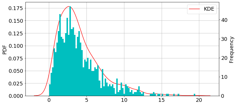
E[X]: Mean, V[X]: Standard deviationとして、それぞれの分布をNumpyで描きます 描写にはSeabornのkdeplotを用います。
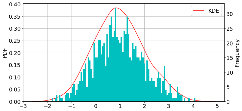
正規分布
import numpy as np

np.random.seed(57)
mu, sigma = 1, 1
data = np.random.normal(mu, sigma, 1000)
import matplotlib.pyplot as plt
import seaborn as sns

fig = plt.figure(figsize=(12,6))
plt.rcParams["font.size"] = 18
ax1 = plt.subplot(111) #density plot
ax2 = ax1.twinx() #histogram

sns.kdeplot(data, label="KDE", ax=ax1, color="r") #density plot
ax2.hist(data, bins=100, color="c") #histogram

ax1.grid()

ax1.set_ylabel("PDF")
ax2.set_ylabel("Frequency")

plt.show()
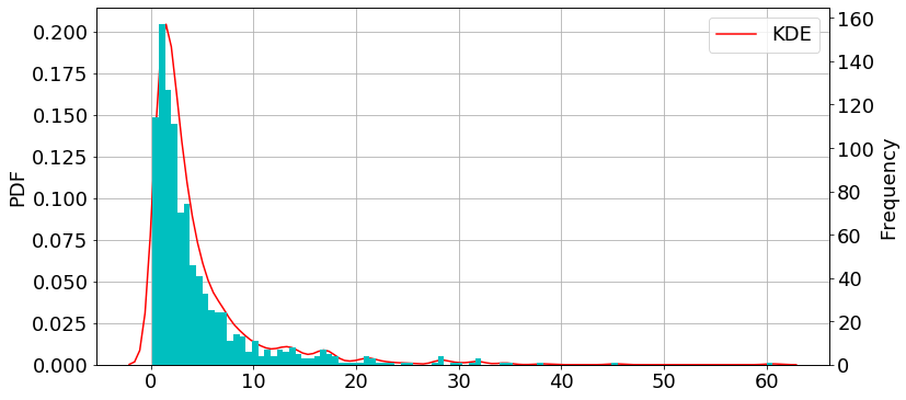
対数正規分布
import numpy as np

np.random.seed(57)
mu, sigma = 1, 1
data = np.random.lognormal(mu, sigma, 1000)
import matplotlib.pyplot as plt
import seaborn as sns

fig = plt.figure(figsize=(12,6))
plt.rcParams["font.size"] = 18
ax1 = plt.subplot(111) #density plot
ax2 = ax1.twinx() #histogram

sns.kdeplot(data, label="KDE", ax=ax1, color="r") #density plot
ax2.hist(data, bins=100, color="c") #histogram

ax1.grid()

ax1.set_ylabel("PDF")
ax2.set_ylabel("Frequency")

plt.show()
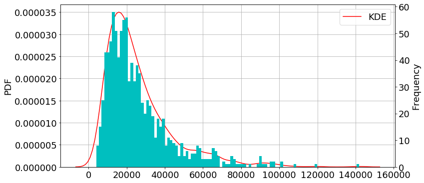
二項分布
N: 試行回数(number of trials)、θ: 成功の確率(probability of each trial)
import numpy as np

np.random.seed(57)
n, p = 10, 0.6
data = np.random.lognormal(n, p, 1000)
import matplotlib.pyplot as plt
import seaborn as sns

fig = plt.figure(figsize=(12,6))
plt.rcParams["font.size"] = 18
ax1 = plt.subplot(111) #density plot
ax2 = ax1.twinx() #histogram

sns.kdeplot(data, label="KDE", ax=ax1, color="r") #density plot
ax2.hist(data, bins=100, color="c") #histogram

ax1.grid()

ax1.set_ylabel("PDF")
ax2.set_ylabel("Frequency")

plt.show()
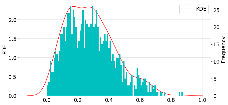
ベータ分布
import numpy as np

np.random.seed(57)
a, b = 2, 5
data = np.random.beta(a, b, 1000)
import matplotlib.pyplot as plt
import seaborn as sns

fig = plt.figure(figsize=(12,6))
plt.rcParams["font.size"] = 18
ax1 = plt.subplot(111) #density plot
ax2 = ax1.twinx() #histogram

sns.kdeplot(data, label="KDE", ax=ax1, color="r") #density plot
ax2.hist(data, bins=100, color="c") #histogram

ax1.grid()

ax1.set_ylabel("PDF")
ax2.set_ylabel("Frequency")

plt.show()
ガンマ分布
import numpy as np
np.random.seed(57)
k, theta = 2, 2
data = np.random.gamma(k, theta, 1000)
import matplotlib.pyplot as plt
import seaborn as sns

fig = plt.figure(figsize=(12,6))
plt.rcParams["font.size"] = 18
ax1 = plt.subplot(111) #density plot
ax2 = ax1.twinx() #histogram

sns.kdeplot(data, label="KDE", ax=ax1, color="r") #density plot
ax2.hist(data, bins=100, color="c") #histogram

ax1.grid()

ax1.set_ylabel("PDF")
ax2.set_ylabel("Frequency")

plt.show()
ポアソン分布
import numpy as np

np.random.seed(57)
lam = 10
data = np.random.poisson(lam, 1000)
import matplotlib.pyplot as plt
import seaborn as sns

fig = plt.figure(figsize=(12,6))
plt.rcParams["font.size"] = 18
ax1 = plt.subplot(111) #density plot
ax2 = ax1.twinx() #histogram

sns.kdeplot(data, label="KDE", ax=ax1, color="r") #density plot
ax2.hist(data, bins=100, color="c") #histogram

ax1.grid()

ax1.set_ylabel("PDF")
ax2.set_ylabel("Frequency")

plt.show()

指数分布
import numpy as np

np.random.seed(57)
theta = 2
data = np.random.exponential(theta, 1000)
import matplotlib.pyplot as plt
import seaborn as sns

fig = plt.figure(figsize=(12,6))
plt.rcParams["font.size"] = 18
ax1 = plt.subplot(111) #density plot
ax2 = ax1.twinx() #histogram

sns.kdeplot(data, label="KDE", ax=ax1, color="r") #density plot
ax2.hist(data, bins=100, color="c") #histogram

ax1.grid()

ax1.set_ylabel("PDF")
ax2.set_ylabel("Frequency")

plt.show()

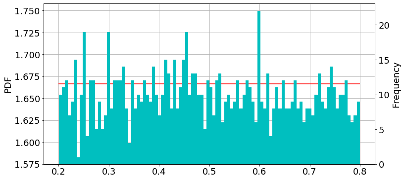
一様分布
import numpy as np

np.random.seed(57)
a, b = 0.2, 0.8
data = np.random.uniform(a, b , 1000)
import matplotlib.pyplot as plt

fig = plt.figure(figsize=(12,6))
plt.rcParams["font.size"] = 18
ax1 = plt.subplot(111) #density plot
ax2 = ax1.twinx() #histogram

ax1.hlines(1/(b-a), a, b, color="r")
ax2.hist(data, bins=100, color="c") #histogram

ax1.grid()

ax1.set_ylabel("PDF")
ax2.set_ylabel("Frequency")

plt.show()
参考文献
【Matplotlib】グラフの中にグラフを作成 (Inset Plot in Matplotlib)

はじめに
今回は、グラフの中にもう一つグラフを描く方法に関しての記事です。 グラフを描写するmatplotlibの基礎ができている方は簡単に作成できます。 そうでない方は以下の記事を参考にしてください。
コード
モジュール
まずは必要なモジュールをインポートします。
import numpy as np
import matplotlib.pyplot as plt
from scipy.stats import gaussian_kde #密度プロットに使用
#Inset plot in matplotlibに使用
from mpl_toolkits.axes_grid.inset_locator import (inset_axes, InsetPosition, mark_inset)
データ
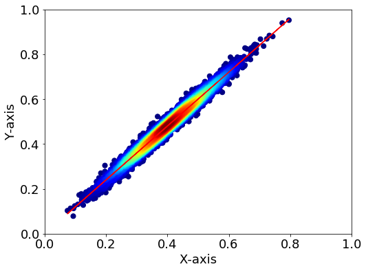
データは相関プロットを想定し、以下の図のようなデータを用意しました。
#データ===================
#乱数の固定
np.random.seed(1)
#x, y のデータ用意
mu, sigma = 0, 0.01
x = 10 * np.random.normal(mu, sigma, size=5000) + 0.4
y = 1.2 * x + 2 * np.random.normal(mu, sigma, size=5000)

#回帰直線
p = np.polyfit(x, y, 1)
y_reg = p[0]*x + p[1]

#描写===================
fig = plt.figure(figsize=(8,6))
plt.rcParams["font.size"] = 18

ax=fig.add_subplot(111)
ax.plot(x, y_reg, color="r")

# KDE probability
xy = np.vstack([x,y])
z = gaussian_kde(xy)(xy)
# zの値で並び替え→x,yも並び替える
idx = z.argsort()
x2, y2, z2 = x[idx], y[idx], z[idx]
ax.scatter(x2, y2, c=z2, s=50, cmap="jet")

#軸設定
ax.set_xlabel("X-axis")
ax.set_ylabel("Y-axis")
ax.set_ylim(0, 1)
ax.set_xlim(0, 1)
※KDEプロットに関しては以下の記事をご覧ください。 runtascience.hatenablog.com
描写
それでは本記事が目的とするグラフを作成してみます。
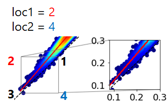
fig = plt.figure(figsize=(6, 6))
plt.rcParams["font.size"] = 18
ax=fig.add_subplot(111)

#1:1のライン
x_1=[0,100]
y_1=[0,100]
ax.plot(x_1,y_1,"--", color="k")

#linear regression
p = np.polyfit(x, y, 1)
y_reg = x*p[0]+p[1]
#correlation
correlation = np.corrcoef(x,y)
#dataCounts
dn=len(x)
print("Slope",p[0],"R", correlation[0,1], "N:", dn)

# KDE probabilityプロット
xy = np.vstack([x,y])
z = gaussian_kde(xy)(xy)
# zの値で並び替え→x,yも並び替える
idx = z.argsort()
x2, y2, z2 = x[idx], y[idx], z[idx]
ax.scatter(x2, y2, c=z2, s=50, cmap="jet")
ax.plot(x,y_reg,"-", color="r")

#範囲設定
ax.set_xlim(0,1)
ax.set_ylim(0,1)

#Inset Plot in Matplotlib
#ax2をaxes内に用意する
ax2 = plt.axes([0, 0, 1, 1]) #axes([左, 下, 幅, 高さ])
#位置の設定(外枠のaxを基準とする)
position = InsetPosition(ax, [0.6, 0.1, 0.3, 0.3]) #[左, 下, 幅, 高さ]
ax2.set_axes_locator(position)
# axの該当範囲に枠を入れる
mark_inset(ax, ax2, loc1=2, loc2=4, edgecolor="gray") #※

ax2.scatter(x2, y2, c=z2, s=50, cmap="jet")
ax2.plot(x,y_reg,"-", color="r")
ax2.plot(x_1,y_1,"--", color="k")

# 表示範囲
ax2.set_ylim(0.08, 0.3)
ax2.set_xlim(0.08, 0.3)

plt.show()
Slope 1.201448761013043 R 0.9866316441109919 N: 5000

※loc1とloc2はそれぞれ、グレーの線の位置を表しており、以下の図のようになっています。
参考文献
それでは🌏
【Matplotlib】pythonで密度プロット(Density plot)
pythonの相関を見る際に密度プロットを作成することを今回の目標とします。 Kernel Density Estimation (カーネル密度推定; KDE)とは、ある有限の標本の中から確率変数の確率密度関数を推定手法のうちの一つである。
詳しい説明は以下の通りです。
カーネル密度推定 - Wikipedia まずは必要なモジュールをインポートします。 まずはデータを用意します。今回は正規分布のデータを適当に用意しました。 先ほどのデータでは相関関係はわかるのですが、データの分布はわかりません。そこで密度プロットをしてみます。 Points 参考コード 次に縦軸に確率密度を取ったグラフを作成します。
まずは必要なモジュールをインポートします。 データを用意します。正規分布の 新品価格 それでは🌏
はじめに
KDEとは
相関
import numpy as np
import matplotlib.pyplot as plt
from scipy.stats import gaussian_kde
データ
各自データがある方はそれを用いてください。#x, y のデータ用意
mu, sigma = 0, 0.01
x = 10 * np.random.normal(mu, sigma, size=5000) + 0.4
y = x + 2 * np.random.normal(mu, sigma, size=5000)
#回帰直線
p = np.polyfit(x, y, 1)
y_reg = p[0]*x + p[1]
np.random.seed()で乱数を固定します(何回実行しても同じ結果が出るように)。
np.random.normal():正規分布の乱数を作成、 mu : 平均値、sigma: 分散描写
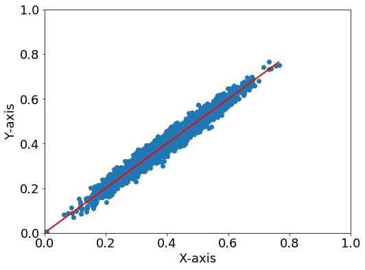
普通の相関プロット
fig = plt.figure(figsize=(8,6))
plt.rcParams["font.size"] = 18

ax=fig.add_subplot(111)
ax.scatter(x, y)
ax.plot(x, y_reg, color="r") #回帰直線

#軸設定
ax.set_xlabel("X-axis")
ax.set_ylabel("Y-axis")
ax.set_ylim(0, 1)
ax.set_xlim(0, 1)
Density plot
fig = plt.figure(figsize=(8,6))
plt.rcParams["font.size"] = 18

ax=fig.add_subplot(111)

#回帰直線
ax.plot(x, y_reg, color="r")

# KDE probability
xy = np.vstack([x,y])
z = gaussian_kde(xy)(xy)
# zの値で並び替え→x,yも並び替える
idx = z.argsort()
x, y, z = x[idx], y[idx], z[idx]
im = ax.scatter(x, y, c=z, s=50, cmap="jet")
fig.colorbar(im)

#軸設定
ax.set_xlabel("X-axis")
ax.set_ylabel("Y-axis")
ax.set_ylim(0, 1)
ax.set_xlim(0, 1)

plt.show()
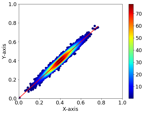
- KDEの計算の後でx,yを並び替えているので、回帰直線のプロットは先にしてください。
- np.vstack([x,y])でxとyを縦方向に結合します。
- .argsort()で並び替え後のインデックスを取得できます。
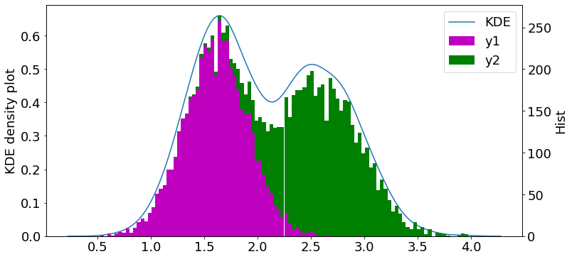
stackoverflow.com確率密度
import numpy as np
import matplotlib.pyplot as plt
#seaborn
import seaborn as sns
from scipy import stats
データ
y1とy2の二山を作成し、yで一つにまとめます。#x
mu, sigma = 0.1, 0.01
x = np.random.normal(mu, sigma, size=5000)
#y
mu, sigma = 0.75, 0.15
y1 = x + 2 * np.random.normal(mu, sigma, size=5000)
mu, sigma = 1., 0.15
y2 = x + 2.5 * np.random.normal(mu, sigma, size=5000)
y = np.append(y1, y2)
描写
fig = plt.figure(figsize=(12,6))
plt.rcParams["font.size"] = 18
ax1 = plt.subplot(111)
ax2 = ax1.twinx()

sns.kdeplot(data=y, label="KDE", ax=ax1)

# ax2.hist(y, bins=100)
ax2.hist([y1, y2], bins=100, stacked=True, color=["m", "g"], label=["y1", "y2"])


#軸設定
ax1.set_ylabel("KDE density plot")
ax2.set_ylabel("Hist")

h1, l1 = ax1.get_legend_handles_labels()
h2, l2 = ax2.get_legend_handles_labels()
ax1.legend(h1+h2, l1+l2, ncol=1)
 軸が二つあるプロットに関しては以下の記事をご覧ください。
参考文献

¥3,630から
(2021/5/5 07:57時点)![]()
【Matplotlib】.rcParamsでグラフの一括設定&見やすくする

はじめに
rcParamsの使い方
今回使うモジュールをインポート
import numpy as np
import matplotlib.pyplot as plt
デフォルトを見てみる
#データの用意
x = np.linspace(0, 2 * np.pi, 50)
ys = []
for i in range(2):
    ys.append(np.sin(x + np.pi*i/2))
fig = plt.figure(figsize=(10,5))

ax = fig.add_subplot(111)
ax.set_title("Title")

ax.plot(x, ys[0], label = "$\\alpha$")
ax.plot(x, ys[1], label = "$\\beta$")

plt.legend()

デフォルトの設定(一部)
font.family: sans-serif
font.size: 10.0
lines.linewidth: 1.5 # line width in points
lines.linestyle: - # solid line
lines.markeredgewidth: 1.0 # the line width around the marker symbol
lines.markersize: 6 # marker size, in points
axes.prop_cycle: cycler('color', ['1f77b4', 'ff7f0e', '2ca02c', 'd62728', '9467bd', '8c564b', 'e377c2', '7f7f7f', 'bcbd22', '17becf'])
選択可能なフォント
Times New Roman, Arial, Helvetica, sans-serif, etc...
色について
#1f77b4 ,
#ff7f0e,
#2ca02c,
#d62728,
#9467bd,
#8c564b,
#e377c2,
#7f7f7f ,
#bcbd22 ,
#17becf
カスタムしてみる
fig = plt.figure(figsize=(10,5))
plt.rcParams["font.family"] = "Arial"
plt.rcParams["font.size"] = 18
plt.rcParams["lines.linewidth"] = 2.5
plt.rcParams["lines.linestyle"] = "--"

ax = fig.add_subplot(111)
ax.set_title("Title")

ax.plot(x, ys[0], label = "$\\alpha$")
ax.plot(x, ys[1], label = "$\\beta$")

plt.legend()

色の周期を変える
matplotlibで描写する際には、自動的に色が割り振られます。その色のデフォルト周期を変えてみます。
今回はデフォルトの
[
#1f77b4 →
#ff7f0e→
#2ca02c→
#d62728→
#9467bd→
#8c564b→
#e377c2→
#7f7f7f →
#bcbd22 →
#17becf]
から、単純な
[
#ff0000→
#000000→
#008000→
#0000ff]
にしてみます。
import numpy as np
import matplotlib.pyplot as plt
from cycler import cycler
#色の選択
print(plt.rcParams["axes.prop_cycle"].by_key()["color"]) #defaultの色を表示

custom_cycler = (cycler(color=["r", "k", "g", "b"]))
plt.rcParams["axes.prop_cycle"] = custom_cycler #customカラーに設定
print(plt.rcParams["axes.prop_cycle"].by_key()["color"]) #customの色を表示
['#1f77b4', '#ff7f0e', '#2ca02c', '#d62728', '#9467bd', '#8c564b', '#e377c2', '#7f7f7f', '#bcbd22', '#17becf']
['r', 'k', 'g', 'b']
次にデータを描写してみます。
※先ほどのグラフの設定が残ってしまっている場合は、plt.rcdefaults()でリセットしましょう。
#データの用意
x = np.linspace(0, 2 * np.pi, 50)
ys = []
for i in range(4):
    ys.append(np.cos(x + np.pi*i/2))
fig = plt.figure(figsize=(10,5))
plt.rcParams["lines.linewidth"] = 2.5

ax = fig.add_subplot(111)
ax.set_title("Title")
for i in range(4):
    plt.plot(x, ys[i], label="i:{}: ".format(i)+custom_cycler.by_key()["color"][i])

plt.legend()

plt.show()

リセットの方法
plt.rcdefaults()
参考文献
【Python】OSを使って指定したファイル一覧を取得し、データフレームに読み込む!

はじめに
今回はos.listdirを用いて、ディレクトリ内にある(指定した)ファイルをリスト化する方法について説明します。
OSインターフェイスとは
osモジュールはオペレーティングシステムとやり取りする関数を何ダースか提供する:
(引用: Pythonチュートリアル第三版p115) osはコンピュータを操作を制御する基本的なソフトウェアのことで、今回の目的のファイル一覧の取得もこの機能を用います。
ファイル一覧を取得(os.listdir(path))
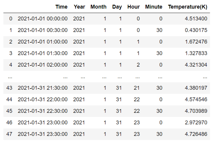
今回使用するディレクトリの階層性は以下のようにします。 (基本的にデータとコードが一緒のディレクトリに入れるとごちゃごちゃになるので、分けています) データは2021年1月1日~31日で、気温.txt・気温.xlsxの31日×2種類あります
└── current_dir
    ├── code.ipynb
    └── atmos_data
             ├── 20210101_temperature.txt
                 ⁝
             ├── 20210131_temperature.txt
             ├── 20210101_temperature.xlsx
                 ⁝
           └── 20210131_temperature.xlsx
それではまずはosモジュールをインポートして、データがあるディレクトリのファイルを全表示させてみます。
import os
os.listdir("./atmos_data/")
['20210101_temperature.txt',
 '20210101_temperature.xlsx',
 '20210102_temperature.txt',
・・・・・・
 '20210131_temperature.txt',
 '20210131_temperature.xlsx']
拡張子指定&データの種類指定
os.listdirを利用して、拡張子の指定ができます。方法は以下の通りです。
path = "./atmos_data/"
dir_list = os.listdir(path)
dir_list_temp = [x for x in dir_list if ".txt" in x]
print(dir_list_temp)
['20210101_temperature.txt',
'20210102_temperature.txt',
 '20210103_temperature.txt',
・・・・・・
'20210130_temperature.txt',
'20210131_temperature.txt']
(1) dir_listに、ディレクトリ内の全ファイルをリストとして代入。
(dir_listには、.txtと.xlsxが混ざっている)
(2) dir_list_tempに、".txt"の拡張子を持つファイルのみを代入。
(dir_list_tempには、.txtのみが入っている)
取得したファイルの読み込み
まずはモジュールを読み込みます
import os
import pandas as pd
pandasはデータフレームの処理に用います。
pandasについては、以下の記事を参照してください。
次に、指定ディレクトリ内の指定ファイル一覧をリスト化をします。
#指定ディレクトリ内の指定ファイル一覧をリスト化
path = "./atmos_data/"
dir_list = os.listdir(path)
dir_list_temp = [x for x in dir_list if ".txt" in x]
print("LIST", dir_list_temp)

#DataFrameの確認
df = pd.read_csv(path + dir_list_temp[0], index_col=0) #1つ目のファイルを使う
print("DataFrame", df)
df_cols = df.columns #1つ目のファイルのカラムをリストとして取得
print("COLUMNS", df_cols)
そして、dir_list_tempに代入したパスをディレクトリから読み込みます。
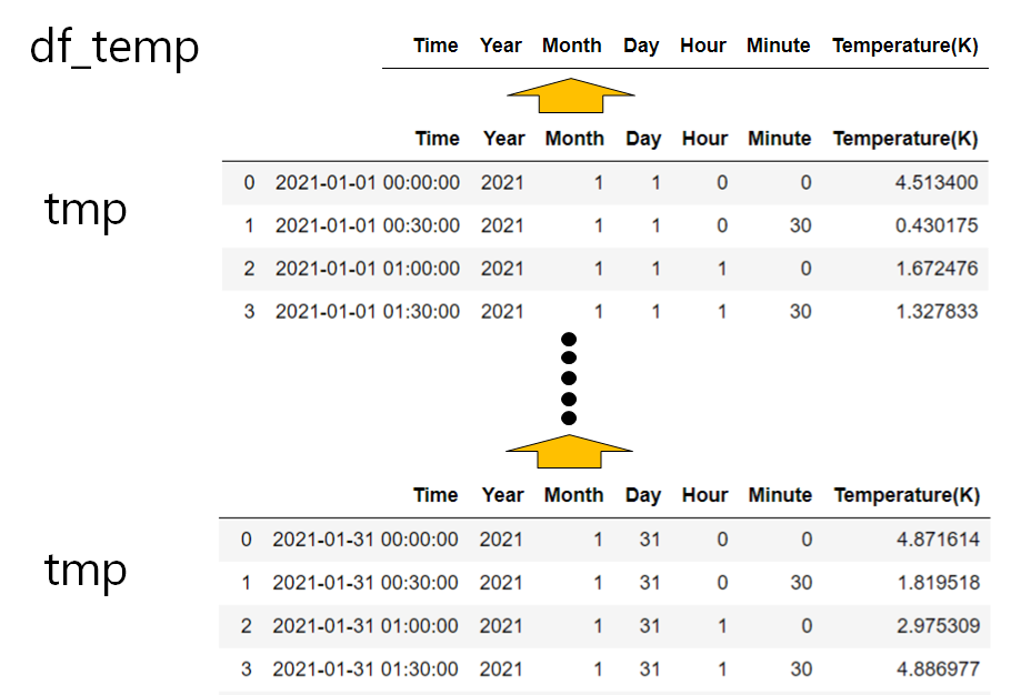
df_temp = pd.DataFrame(columns=df_cols) #空のdfを作成
for dir_list in dir_list_temp:
    tmp = pd.read_csv(path + dir_list, index_col=0)
    df_temp = pd.concat([df_temp, tmp], axis = 0) #縦方向に結合
df_temp
イメージ
(1)空のdfを用意する。この時、df_colsでカラムを設定する。
(2)dir_list_tempを1つずつ選択し、データを読み込み(tmp)、空のリストに縦方向に結合していく(pd.concat)(1/1~1/31)。
番外編: globを使う(拡張子指定)
import glob
path = "./atmos_data/*.txt"

list_dir = glob.glob(path)
print(list_dir)
['./atmos_data\\20210101_temperature.txt',
 './atmos_data\\20210102_temperature.txt',
 './atmos_data\\20210103_temperature.txt',
・・・・・・
'./atmos_data\\20210130_temperature.txt',
'./atmos_data\\20210131_temperature.txt']
参考文献
それでは🌏
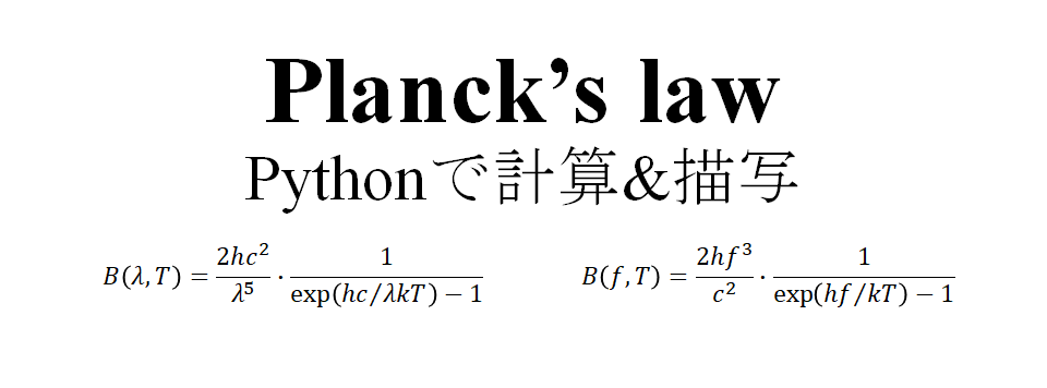
【Science】黒体放射の式Planckの法則(Planck's law)をPythonで計算&描写
 黒体放射の式Planckの法則(Planck's law)の計算と描写
今回は波長と周波数の関数を使用。
黒体放射の式Planckの法則(Planck's law)の計算と描写
今回は波長と周波数の関数を使用。
Planck's law
プランクの法則とは、
物質と熱平衡状態の放射が出すエネルギー密度(放射輝度)分布を表す法則
である(引用:天文学辞典)。
- 発見者はドイツの物理学者マックス・プランクである。
- プランクの法則は、黒体の輝度(radiance) を表す式であり、温度と波長or波数or周波数の関数となっている。
式は以下のように表される(放射輝度:radiance[W m-3 sr-1]or [W m-2sr-1 Hz-1 ])。
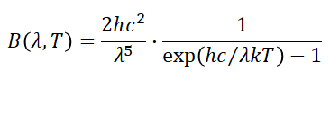
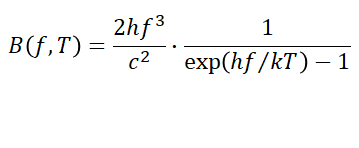
B: Spectral radiance of Black body (Energy)
λ: wavelength[m], f: frequency[Hz]
h: Plank's constant($=6.62606896×10^{-34}$)
k: Boltzmann constant($=1.3806504×10^{-23}$)
c: Speed of light($=2.99792458×10⁸$)
コード
定数の定義
c = 2.99792458e8 #c=speed of light[m/s]
h = 6.62606896e-34 #h=Planck constant[Js]
k = 1.3806504e-23 #k=Boltzmann constant[J/K]
T_arr = np.array([7000, 6000, 5000, 4000, 3000, 255]) #temprature[K]
lam_arr = np.linspace(1e-9,1e-2,1000000) #wavelength[m]
f_arr = np.linspace(1e10, 1e16,1000000) #frequency[Hz]
c,h,kは以下のサイトの値を使用 https://japanknowledge.com/contents/common/butsuriteisu.html
波長の関数
関数の定義
def planck_lam(lam, T):
    """Definicion of Planck's law
        return B(lambda, temprature)[radiance:W/m^3/sr]
        calculation=>a * b
    """
    a = 2.0 * h * (c**2) / (lam**5)
    b = 1 / (np.exp(h*c/(k*lam*T)) - 1.0)
    radiance = a * b
    return radiance
描写
fig = plt.figure(figsize=(10,5))
plt.rcParams["font.size"] = 16
ax = plt.subplot(111)
ax.set_title("Blackbody spectrum (Radiance)")

for T in T_arr:
    B = planck_lam(lam_arr, T)
    # x-axis:lambda[m]→[nm](*1e9) y-axis: [W/m^3/sr]→[kW/m^2/sr/µm](*1e-3)
    ax.plot(lam_arr*1e9, B*1e-3*1e-6, label="T={}[K]".format(T))

#軸設定
ax.set_xscale("log")
ax.set_yscale("log")
ax.set_xlim(1e2, 1e4)
ax.set_ylim(1e1, 1e5)
ax.set_ylabel("Spectral radiance [kW $\mathrm{m^{-2} sr^{-1} \mu m^{-1}}$]")
ax.set_xlabel("Wavelength [$\mathrm{n m}$]")

ax.grid(which="both",color="gray",linewidth=0.2)
ax.legend()

周波数の関数
関数の定義
def planck_f(f, T):
    """Definicion of Planck's law
        return B(frequency, temprature)[radiance:W/m^2/sr/Hz]
        calculation=>a * b
    """
    a = 2.0 * h * (f**3) / (c**2)
    b = 1 / (np.exp(h*f/(k*T)) - 1.0)
    radiance = a * b
    return radiance
描写
plt.rcParams["font.size"] = 16
ax = plt.subplot(111)
ax.set_title("Blackbody spectrum (Radiance)")

for T in T_arr:
    B = planck_f(f_arr, T)
    # x-axis:frequency[Hz], y-axis: [W/m^2/sr/Hz]→[kW/m^2/sr/Hz](*1e-3)
    ax.plot(f_arr, B*1e-3, label="T={}[K]".format(T))

#軸設定
ax.set_xscale("log")
ax.set_yscale("log")
ax.set_xlim(1e12, 4e15)
ax.set_ylim(1e-15, 1e-9)
ax.set_ylabel("Spectral radiance [kW $\mathrm{m^{-2} sr^{-1} Hz^{-1}}$]")
ax.set_xlabel("Frequency [$\mathrm{Hz}$]")

ax.grid(which="both",color="gray",linewidth=0.2)
ax.legend()

参考文献
それでは🌏
【Matlotlib】Python Matplotlib基礎のキ(plot・scatter・bar・errorbar)
plot
plotでは点を線で結んだグラフや点グラフを描くことができます。
scatter
scatterでは散布図を描くことができます。散布図の点の色も指定できるため、3次元のデータの表示も可能です。
bar
barは累計数などの表示に用いられます。月ごとのデータ数を表示したり、水蒸気量などはbarです。
errorbar
errorbarではx方向のエラーとy方向のエラーを表示することができます。
データに標準偏差などを表示したいときはこれが便利です。
【Matlotlib】Python Matplotlib基礎のキ(グラフの書き方・figとplt、axes関係・複数グラフ、体裁を整える)

こんにちは。
今日はMatplotlibの基礎のキということではじめてMatplotlibを用いてグラフを描く人向けの記事です。
難しい用語は使っていませんので、初心者向けです。
モジュール
まずはグラフ描写に必要なmatplitlib.pyplotをインポートします
慣習的にpltと略します(as plt)
import matplotlib.pyplot as plt
データをプロットしてみよう
まずは基本的なデータをプロットしてみます
import numpy as np
x = np.arange(0,10,1)
y = x*2

plt.plot(x, y)

plt.show()
※np.arange(開始, 終了,間隔)で連続した配列を作成できる
※plt.plot(x, y)で線グラフが描けます。
※plt.show()でグラフを表示します。

figとplt, axの関係
グラフはplt.plot(x, y)で簡単に描写できますが、さらに高度なグラフ(複数グラフを1つにまとめるなど)を書くには限界があります(パワポでできた図を付けたりするのは大変です。) そこで、大枠をfigとし、内側にaxを作ることで複数のグラフも表現できます。
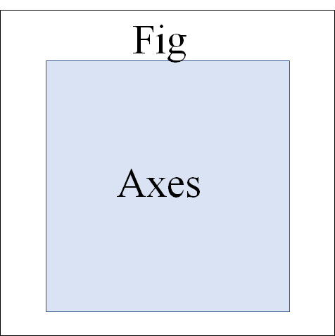
サブプロットであるaxesは以下のコードで作成できます。
fig = plt.figure(figsize=(5, 5)) #figをインスタンス化とサイズの決定
ax = fig.add_subplot(111) #axをfigの中に作成(axが1つのグラフの時は111)

#タイトルの設定
ax.set_title("Title")
#プロットとラベルの設定(後で凡例にできる)
ax.plot(x, y, label="data")
#凡例の表示
plt.legend()
#グラフの保存、formatをpngに、dpiは解像度
fig.savefig("XXX.png" ,format="png", dpi=300)

plt.show()

※fig.add_subplot(111)は(横,縦,グラフの番号)で決められる。詳細は複数グラフへ。
複数グラフ
axを使って複数グラフを作成します。
axが複数でるため、fig.add_subplot()の括弧内の数字を変える必要があります。
例1ー基本

まずはfigの中にグラフを2つ表示します。
figの大きさはx軸10とy軸5、axは横に2つ並べます
#データ
x1 = np.arange(0,10,1)
y1 = x1*2
x2 = np.arange(0,10,1)
y2 = x2*3
fig = plt.figure(figsize=(10,5))
ax1 = fig.add_subplot(121)
ax1.set_title("Title1")
ax2 = fig.add_subplot(122)
ax2.set_title("Title2")

ax1.plot(x1, y1)
ax2.plot(x2, y2)

plt.show()

例2ー応用(forループを使う)
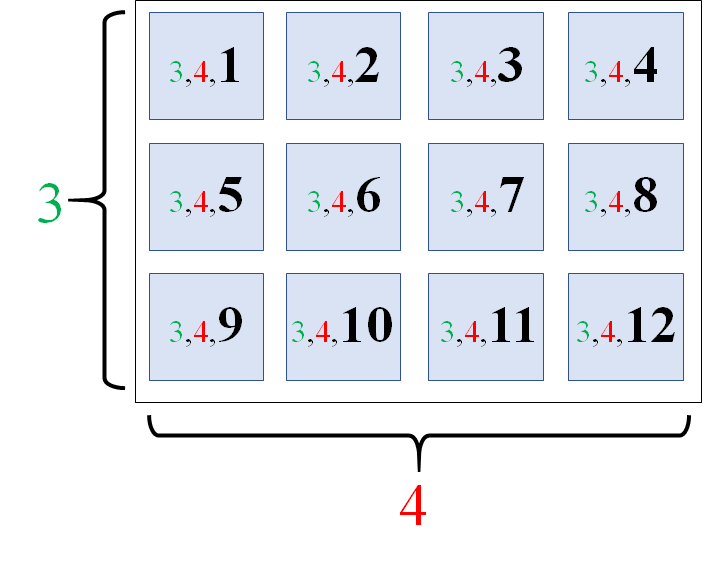
次はループを回して、グラフを描写します。
fig, axes = plt.subplots(nrows=4, ncols=3,figsize=(20,15))
plt.suptitle("Title")

#ここから12個グラフ
for i, ax in enumerate(axes.flat):
  #i番目のaxを用意
  ax = plt.subplot(3, 4, i+1)

  #データ(yのデータは100個のランダムな数字を2倍した値)
  xdata = np.arange(0,100,1) *1
  ydata = np.random.rand(100) *2
  #描写
  ax.plot(xdata, ydata)

  ax.set_title(i+1)

plt.show() 
グラフの体裁
グラフの描写において欠かせないのが全体の見栄えです。文字の大きさがバラバラだったり、軸が適切に書かれていなかったり、範囲が不適切であったりすると、グラフを見ている人に誤解を招くことになってしまいます。
Point
- フォントの統一(Arial や TimesNewRomanなど)
- フォントサイズを適切に(見やすい大きさや統一性)
- タイトルや軸ラベルの設定
- メモリの設定
- 軸の範囲設定
x = np.arange(0,10,1)
y = x*2
fig = plt.figure(figsize=(5, 5))
ax = fig.add_subplot(111)
plt.rcParams["font.size"] = 18 #フォントサイズの一括設定
ax.set_title("Title")

ax.plot(x, y, label="data")

#軸範囲
ax.set_xlim(0, 10) #x軸
ax.set_ylim(0, 20) #y軸

#軸ラベル
ax.set_xlabel("X-axis") #x軸
ax.set_ylabel("Y-axis") #y軸

#メモリの詳細設定
ax.minorticks_on() #補助メモリ(小さいメモリ)を表示する
#主目盛りの設定、axisはbothでxy軸、majorが主目盛り、top・right・left・bottomで軸の表示設定ができる
ax.tick_params(axis="both", which="major",direction="in",length=5,width=2,top="on",right="on")
ax.tick_params(axis="both", which="minor",direction="in",length=2,width=1,top="on",right="on")
#凡例の表示
plt.legend()

plt.show()

それでは
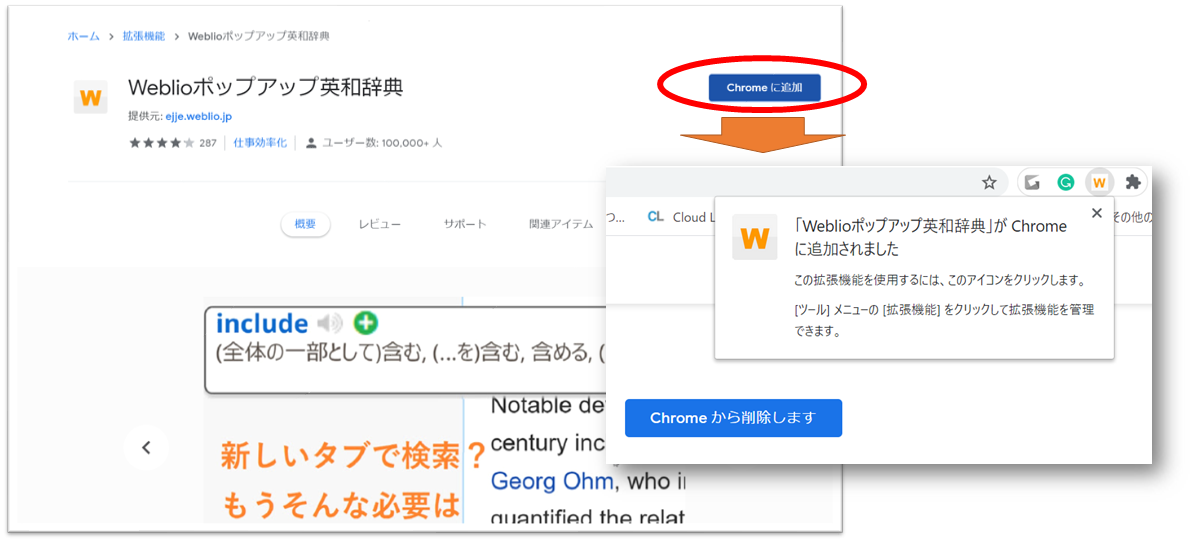
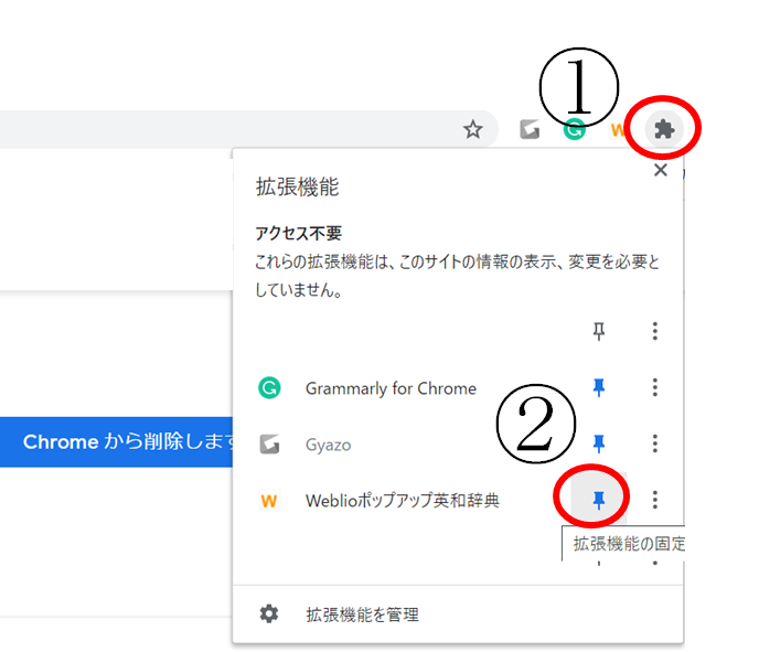
【English】Weblio拡張機能でWebでの英単語検索がラクラクに!機能追加方法と使い方


【Pandas】Python Pandas基礎編(DataFrame結合 concat, merge, join)

こんにちは
Pandasを用いたデータフレームの結合(縦方向・横方向)についてです!
始める前に
まずはpandasをインポートしましょう
import pandas as pd
横方向
例として用いるデータフレーム
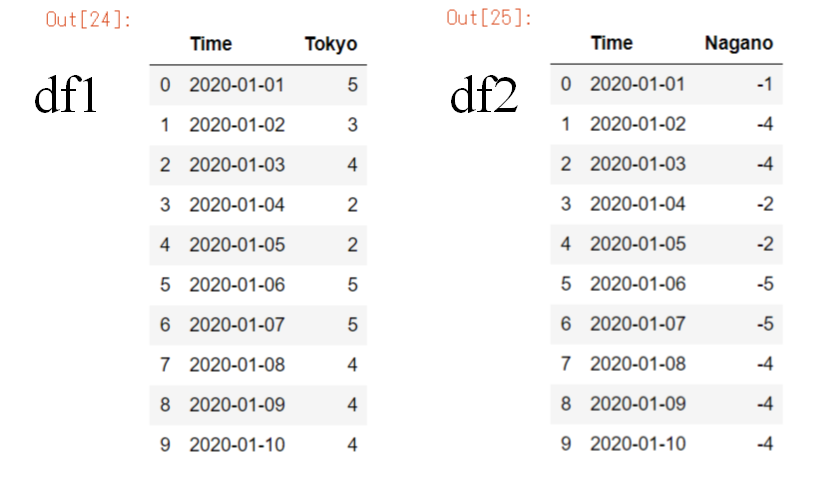
import numpy as np
data1 = np.array([["2020-01-01",5]
,["2020-01-02",3]
,["2020-01-03",4]
,["2020-01-04",2]
,["2020-01-05",2]
,["2020-01-06",5]
,["2020-01-07",5]
,["2020-01-08",4]
,["2020-01-09",4]
,["2020-01-10",4]])
df1 = pd.DataFrame(data1, columns=["Time", "Tokyo"])
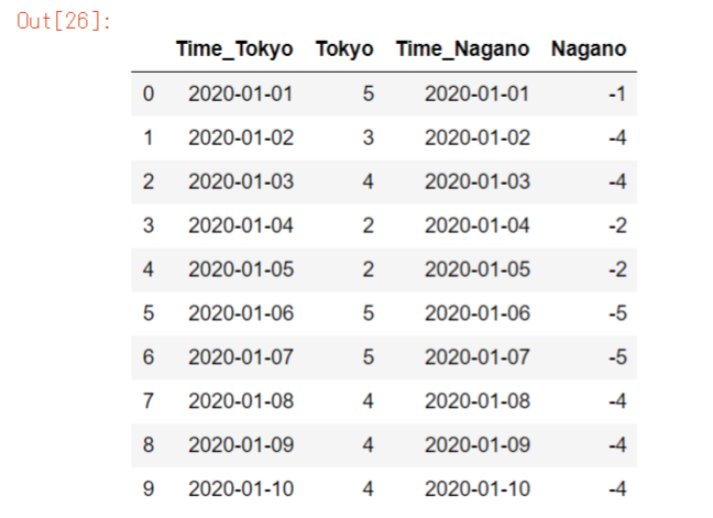
data2= np.array([["2020-01-01",-1]
,["2020-01-02",-4]
,["2020-01-03",-4]
,["2020-01-04",-2]
,["2020-01-05",-2]
,["2020-01-06",-5]
,["2020-01-07",-5]
,["2020-01-08",-4]
,["2020-01-09",-4]
,["2020-01-10",-4]])
df2 = pd.DataFrame(data2,columns=["Time", "Nagano"])pd.concat()
pd.concat()は縦軸(axis=0)または横軸(axis=1)を軸として複数のデータフレームを結合できます。
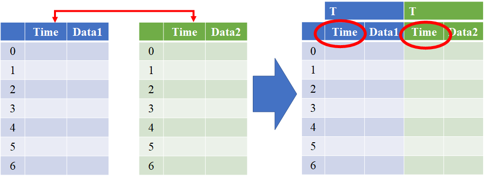
df3 = pd.concat([df1, df2], axis=1, keys="TN")
df3
※keysで複数のデータフレームの頭文字を付けることができる。例えば、3つのデータフレームのTokyo、Nagano、Okinawaを結合するとしたら、keys="TNO"とできる。

Tokyoのみを取り出したいときは、以下のようにします。
df3["T"] 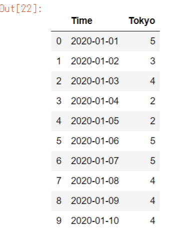
pandas.concat — pandas 1.2.0 documentation
.join()
.join()はindexを軸として、2つのデータフレームを結合できます。
同じカラムを区別して結合できます。

df3 = df1.join(df2, lsuffix="_Tokyo", rsuffix="_Nagano")
df3
l※suffixは左側の重複カラムにラベルを付け、rsuffixは右側。
pandas.DataFrame.join — pandas 1.2.0 documentation
pd.merge()
pd.merge()はindexまたはcolumnを軸として2つのデータフレームを結合できます。
同じカラムは結合されます。今回は「Time」が結合されました。

df3 = pd.merge(df1, df2)
df3 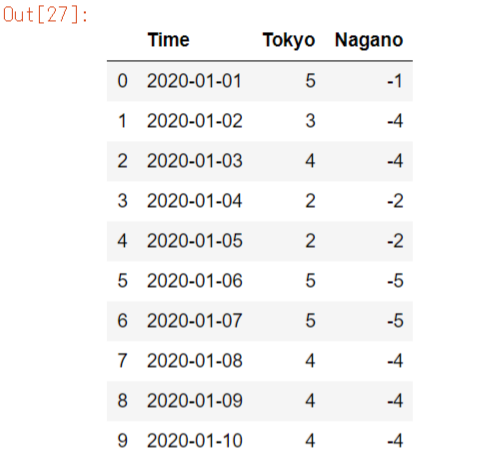
pandas.merge — pandas 1.2.0 documentation
縦方向
例として用いるデータフレーム

import numpy as np
data_a = np.array([["2020-01-01",5]
,["2020-01-02",3]
,["2020-01-03",4]
,["2020-01-04",2]
,["2020-01-05",2]])
df_a = pd.DataFrame(data_a,columns=["Time", "Tokyo"])
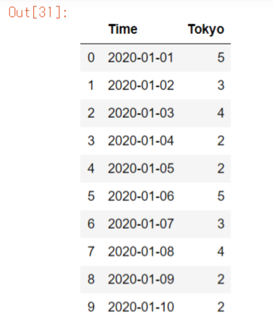
data_b = np.array([["2020-01-06",5]
,["2020-01-07",3]
,["2020-01-08",4]
,["2020-01-09",2]
,["2020-01-10",2]])
df_b = pd.DataFrame(data_b,columns=["Time", "Tokyo"])
pd.concat()
縦方向の結合にはpd.concat()が多用されます。
pd.concat()は縦軸(axis=0)または横軸(axis=1)を軸として複数のデータフレームを結合できます。
同じカラムは結合されます。

df_c = pd.concat([df_a, df_b], ignore_index=True)
df_c
※ignore_index=Trueでインデックスを振りなおし
pandas.concat — pandas 1.2.0 documentation
.append()
.append()は2つのデータフレームあるいはシリーズを縦方向に結合できます。

df_c = df_a.append(df_b).reset_index(drop=True)
df_c
※①df_a.append(df_b)
②.reset_index(drop=True)
pandas.Series.append — pandas 1.2.0 documentation
pandas.DataFrame.append — pandas 1.2.0 documentation
それでは
参考文献
最終更新日
2021/1/6
【Word】数式のTips(数式記入・数式番号・等号揃え・行列の行と列追加)

皆さんこんにちは。
理系の皆さんはWordでレポートを作成するときに、必ずと言って良いほど数式を使いますよね。
今回はWordにおける数式のTipsをいくつかご紹介したと思います。
数式表示ショートカット
数式のショートカットは覚えてしまいましょう
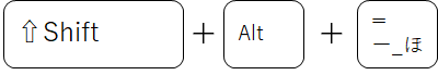
[Shift]+[Alt]+[=]で数式のリボンがでます。
数式の記入方法
数式の記入方法を2つご紹介します。
UnicodeとLaTeXがあります。どちらもギリシャ文字などの基本的な文字は同じですが、ベクトルの表記などの打ち方が異なるので注意しましょう
詳しくは以下をご覧ください
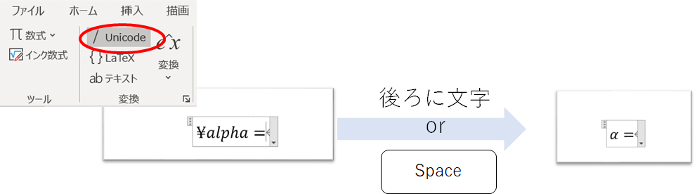
Unicode
Unicodeは後ろに文字またはスペースキーを押すだけで、目的の表記がでます。
分数もスラッシュ(/)を打つだけで出せるので便利です。
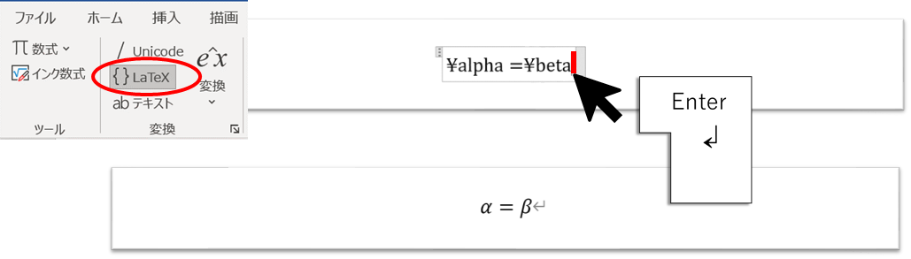
LaTeX
LaTeXは最後に数式の端に移動し、Enterを押すことで、目的の表記がでます。
コマンド集がインターネット上にたくさんあるので便利です。
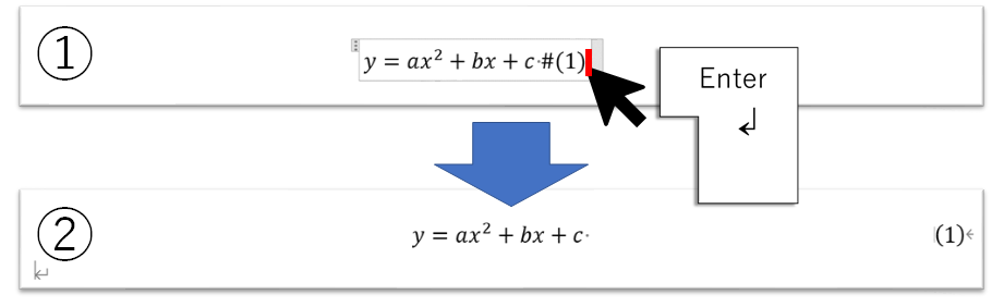
数式番号の設定
数式番号の設定はいかの手順で進めます
①数式の終わりに「スペース + # + ()」を記入する
②参考資料>図表番号の挿入
③ラベルを「数式」に、ラベルを図表番号から除外するにチェック

図表番号の挿入したら、番号を右寄せにします。
①数式の端をクリック
②Enterを入力
数式等号揃え
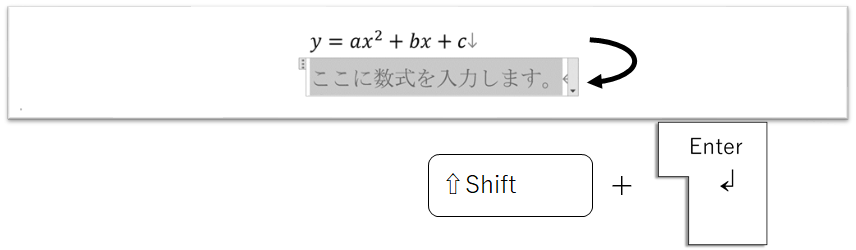
数式を連続して2つ入力する際は、「Shift+Enter」で改行できます。
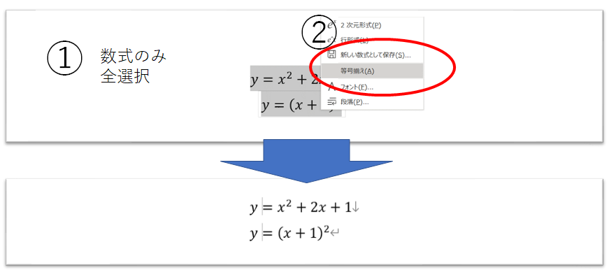
以下の手順で等号揃えをします。
①数式のみを全選択
②等式揃えを選択
行列の行・列追加
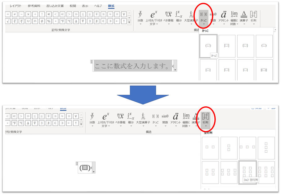
行列のデフォルトでは、最大で3×3行列までです。
そこで、それ以上の列or行を追加したい場合は以下の操作をします。
まずは、行列を作成します。
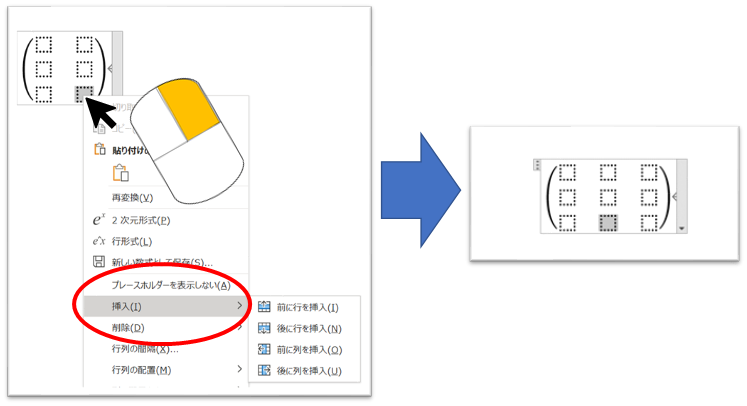
行or列追加の際には、
①どこかの行列を選択し右クリックします
②挿入>挿入したい行or列の選択
ギリシャ文字など
LaTeXの記入方法が使用できます。
ギリシャ文字を一つ一つ上のリボンから探してマウスでクリックして、、、
とやると時間がかかってしまいます。数式を多用する方は覚えてしまいましょう
例えばαを記入するしたいときは、数式で「¥alpha」と入力します。
それでは
最終更新日
2021/1/5
【Pandas】Python Pandas基礎編(DataFrame作成・選択)

こんにちは
今日はPandasの基本的な使用方法について話していきたいと思います!
Pandasとは、Pythonでのデータ解析に用いられるライブラリのこと。
DataFrame作成
まず初めに、pandasをインポートしていきましょう
import pandas as pd
インポートする
テキストファイルやExcelファイルからインポートすることによって、DataFrameを作成できます。
詳しくは以下の記事をご覧ください。
リスト・配列から作成
リストと配列からDataFrameを作成することができます。
データフレームとして読み取ったデータは慣習的にdfと定義します。
今回以下の配列とリストを用意しました。
import numpy as np
data_arr1 = np.arange(10)
data_list1 = [0,1,2,3,4,5,6,7,8,9]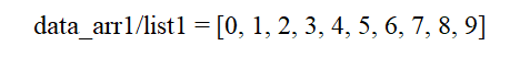
それでは
pd.DataFrame(Data, index, columns, dtype)で変換します。
Columns(カラム)
df1 = pd.DataFrame(data_arr1,columns=["data"])
# df = pd.DataFrame(data_list1,columns=["data"])
df1
※列名をcolumnsで 指定できます。
※リストと配列は同じデータフレームを返すので、リストのほうをコメントアウトしています。
Index(インデックス)
idx_list =["A","B", "C","D","E","F","G","H","I","J"]
df2 = pd.DataFrame(data_arr1,index=idx_list,columns=["data"])
df2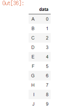
※インデックス名をindexで 指定できます。
dtype
df3 = pd.DataFrame(data_arr1,columns=["data"], dtype=float)
df3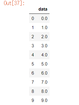
※データフレームのdtypeを 指定できます。
n×mのDF
listではn×mの行列をデータフレームに変換できませんが、配列なら可能です。
例として、10×10の配列を以下のように定義します 。
data_arr2 = np.arange(10*10).reshape(10,10)
data_arr2
>>>array([[ 0,  1,  2,  3,  4,  5,  6,  7,  8,  9],
          [10, 11, 12, 13, 14, 15, 16, 17, 18, 19],
          [20, 21, 22, 23, 24, 25, 26, 27, 28, 29],
          [30, 31, 32, 33, 34, 35, 36, 37, 38, 39],
          [40, 41, 42, 43, 44, 45, 46, 47, 48, 49],
          [50, 51, 52, 53, 54, 55, 56, 57, 58, 59],
          [60, 61, 62, 63, 64, 65, 66, 67, 68, 69],
          [70, 71, 72, 73, 74, 75, 76, 77, 78, 79],
          [80, 81, 82, 83, 84, 85, 86, 87, 88, 89],
          [90, 91, 92, 93, 94, 95, 96, 97, 98, 99]])
そしてこれをデータフレームに変換します。
col_list = ["data1", "data2", "data3", "data4", "data5", "data6", "data7", "data8", "data9", "data10"]
df4 = pd.DataFrame(data_arr2,columns=col_list)
df4
データの選択
データフレームはエクセルファイルのように扱うことができます。
例えば、日付とその日の気温が入ったファイルをデータフレームとして読み込み、
春の期間だけのデータを抽出したり、気温が20度以上の日のデータのみを抽出したりできます。
以下のデータ(先ほどのdf4)を使用します。
df4⇓

loc
まずはlocです。locはデータフレームの必要な情報のみをカラムを基準として抜き取れます。
条件ひとつ
まずはカラムdata3の値が60未満を満たすデータフレームを選択します
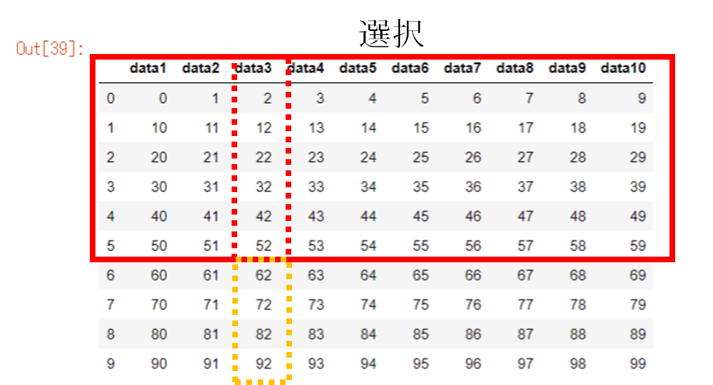
df5 = df.loc[df["data3"] < 60]
df5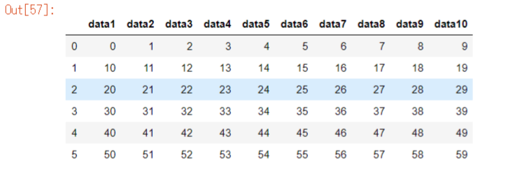
複数条件
以下のような範囲設定もできます。
30≦data3≦60

df6 = df.loc[(df["data3"] >= 30) & (df["data3"] <= 60)].reset_index(drop=True)
df6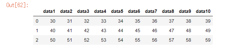
※&は「かつ」、|は「または」
※drop_index(reset=True): indexを0から振りなおす
iloc
次にilocです。ilocはデータフレームの必要な情報のみをインデックスを基準として抜き取れます。
条件ひとつ

df7 = df.iloc[0, :]
df7
複数条件
.iloc[開始行:終了行-1, 開始列:終了列-1]
※終了の行or列を最後までしたい場合は「開始行or列:」のように後ろに数字を書かない
例).iloc[2:8, 1:3]

df8 = df.iloc[2:8, 1:3].reset_index(drop=True)
df8
※drop_index(reset=True): indexを0から振りなおす
後ろから数える
後ろから1番目は-1と数えることができます
これを利用して以下の範囲を抜き出します
iloc[2:, 3:-1]
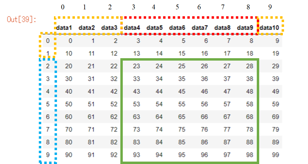
df9 = df.iloc[2:, 3:-1].reset_index(drop=True)
df9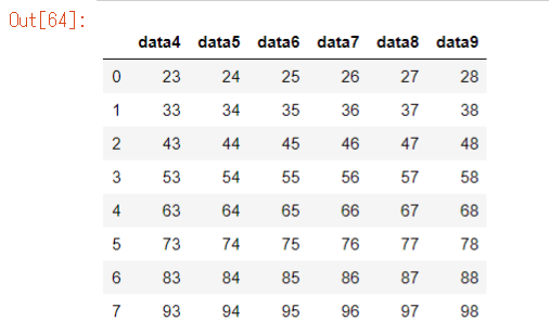
※drop_index(reset=True): indexを0から振りなおす
それでは🌏
最終更新日
2021/1/4
参考文献
【卒論・修論】図表・数式番号(本文相互参照、リンク作成)

こんにちは。
今日は本文の相互参照リンクの作成方法をご紹介します
数式番号の設定は少し違うのでよくご覧下さい。
図
まずは図の相互参照です。
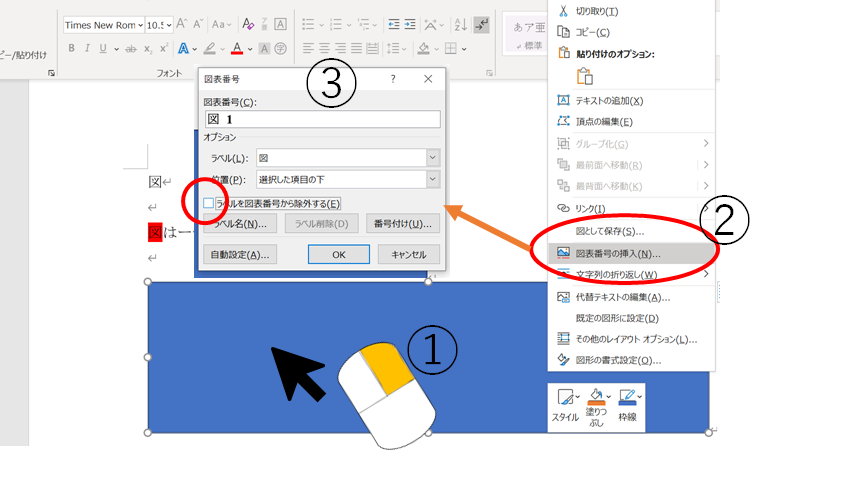
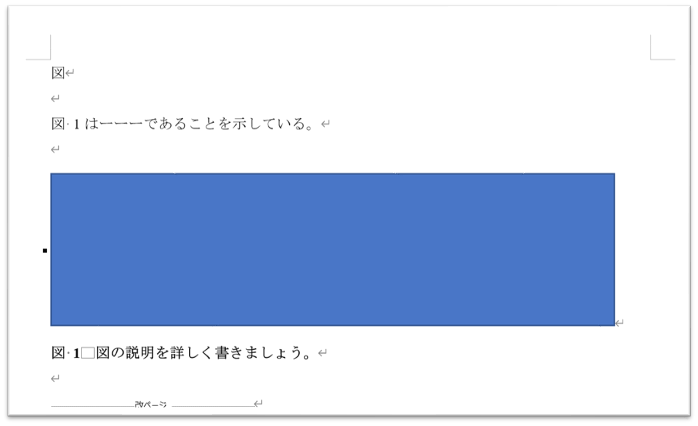
図番号は必ず図の下に挿入しましょう
図番号
図番号はいかの手順で挿入します。
①図を右クリック
②図表番号の挿入
③図表番号を「図」に、位置を「項目の下」に、ラベルを除外するのチェックを外す
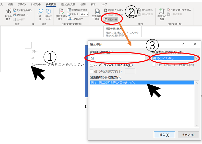
本文相互参照
図の本文相互参照はいかの手順で行います。
①挿入する位置をクリック
②「参考資料」>「相互参照」をクリック
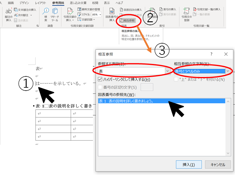
③参照する項目「図」に、相互参照の文字列「番号とラベルのみ」に、参照先をクリック
以上の操作によって以下のように編集できます。
表
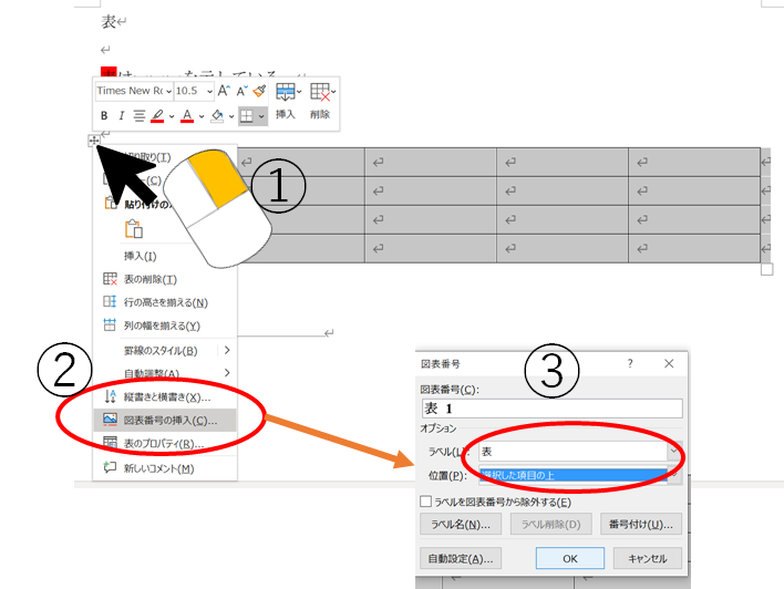
次に表の相互参照です。
表番号は必ず図の上に挿入しましょう
表番号
表番号はいかの手順で挿入します。
①表を全選択して、右クリック
②図表番号の挿入
③図表番号を「表」に、位置を「項目の上」に、ラベルを除外するのチェックを外す
本文相互参照
表の本文相互参照はいかの手順で行います。
①挿入する位置をクリック
②「参考資料」>「相互参照」をクリック
③参照する項目「表」に、相互参照の文字列「番号とラベルのみ」に、参照先をクリック
以上の操作によって以下のように編集できます。

数式
数式の相互参照は、図表番号と少し操作が異なります。
式番号
式番号はいかの手順で挿入します。
①式を入れる位置を選択、位置は#(ここをクリック)とする
②参考資料>図表番号の挿入
③図表番号を「数式」に、ラベルを除外するのチェックする

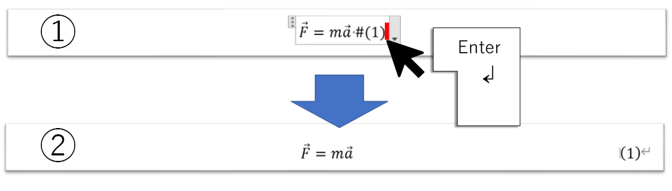
式番号を入れたら以下の作業を行います
①式のいちばん端をクリック(式の外はダメ)
②エンターを押す
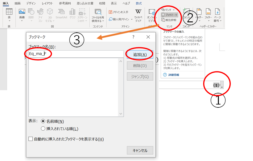
本文相互参照
式の本文相互参照はいかの手順で行います。
①挿入したい数式番号を選択
②「挿入」>「ブックマーク」をクリック
③ブックマーク名を作成>追加
次に本文に挿入します
①挿入したい位置を選択
②「参考資料」>「相互参照」をクリック
③参照する項目「ブックマーク」に、相互参照の文字列「ブックマーク文字列」に、参照先をクリック

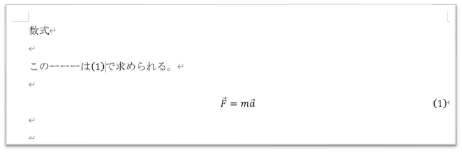
以上の操作によって以下のように編集できます。
最終更新日
2021/1/3
それでは🌏
参考文献
【卒論・修論】見出しの設定(目次の作成~階層構造)

みなさん、こんにちは!
今日は見出しの設定方法についてお話ししていきたいと思います。
レポートや卒論修論作成では見出しを設定すると思います。しかし、この操作に慣れていないと提出間近で焦ることになります。
大学1〜3年生は日頃のレポートで、見出し作成の練習をしていきましょう。
対象
- レポートを書いている学生
- 卒論修論を書いている学生
- Wordの見出し・目次設定に苦戦している人
目次の作成
まずは目次を作成していきます。
卒論修論を例とします。
見出しの設定
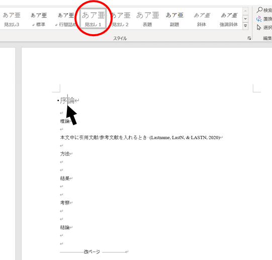
序論に1、方法に2、、、とする前に
見出しの設定を確認&編集します。
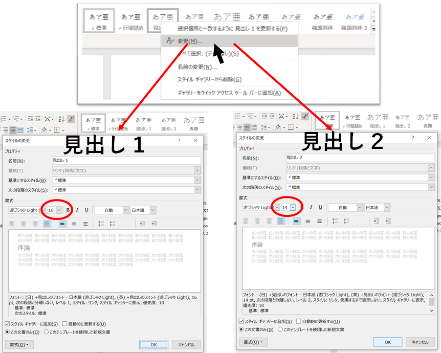
見出し1(章)フォント16
見出し2(節)フォント14
とします。
見出しの設定が終わったら、新しいページに目次を挿入します

目次を挿入したら、それぞれの章(序論〜結論)に見出しをつけていきます。
目次の設定
まず、目次を更新します。

次に、見出しの頭に番号をつけていきます。
段落>番号のマーク
を押して、お好みの見出し番号を設定します。
番号を設定したら、目次の目次を見出しから標準に設定して、更新します。

見出しの番号詳細設定
見出しの詳細設定は、以下のようにできます。
さらに詳細を設定するには、オプションを選択しましょう

見出しのインデント詳細設定
見出しを2まで本文中で選択すると、見出し3までできます。
見出し3はインデントが初期設定でされているので、0字にすると、本文では左寄りの見出しになります。

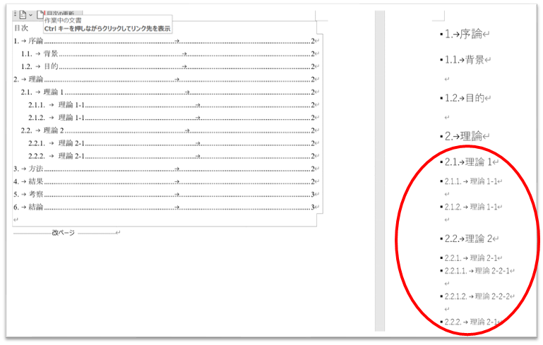
階層構造
卒論や修論では深い階層構造を作成することがあります。
先程の目次の設定のように、それぞれに見出し3や見出し4をつけていきます。
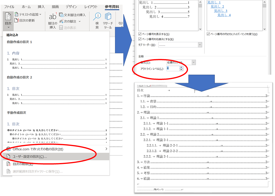
目次の見出し4・見出し5など
見出しの階層を深くすると、目次に表示されません。
その時は、見出しの設定で、アウトラインレベルを4や5にして、目次を更新します。
章番号なしの見出し
章番号を付けない見出しがあると思います。それは、参考文献や謝辞などです。
まず、目次の設定でもあったように見出し1を設定します。
次に番号書式をなしに設定します
そして目次を更新するとできているはずです。


最終更新日2021/1/3
それでは🌏